Introduction
One of the most complex flows in AT&T Account Services area is the Wireless Change Plan flow where existing wireless customers can change their plan. It is mostly because of the way AT&T's latest plans are structured and how they are different from the old constructs. AT&T has been aware of the pinpoints in this flow, however, because of the complexities and level of effort, it never got approval for a complete redesign. I had a unique opportunity to enhance the change plan experience when I had two separate projects at the same time for different touchpoints in the change flow. One of them was a federal government mandate and the second was to improve price/billing transparency.
I supervised a team of three designers to create the different components and to do usability testing. Additionally, I worked with PMs/SPMs and designers from Customer Service, upper funnel, and cart/checkout teams for this project. I had to do lots of show-n- tells to get stakeholder approvals and leadership buy-ins.
Existing experience and pain points
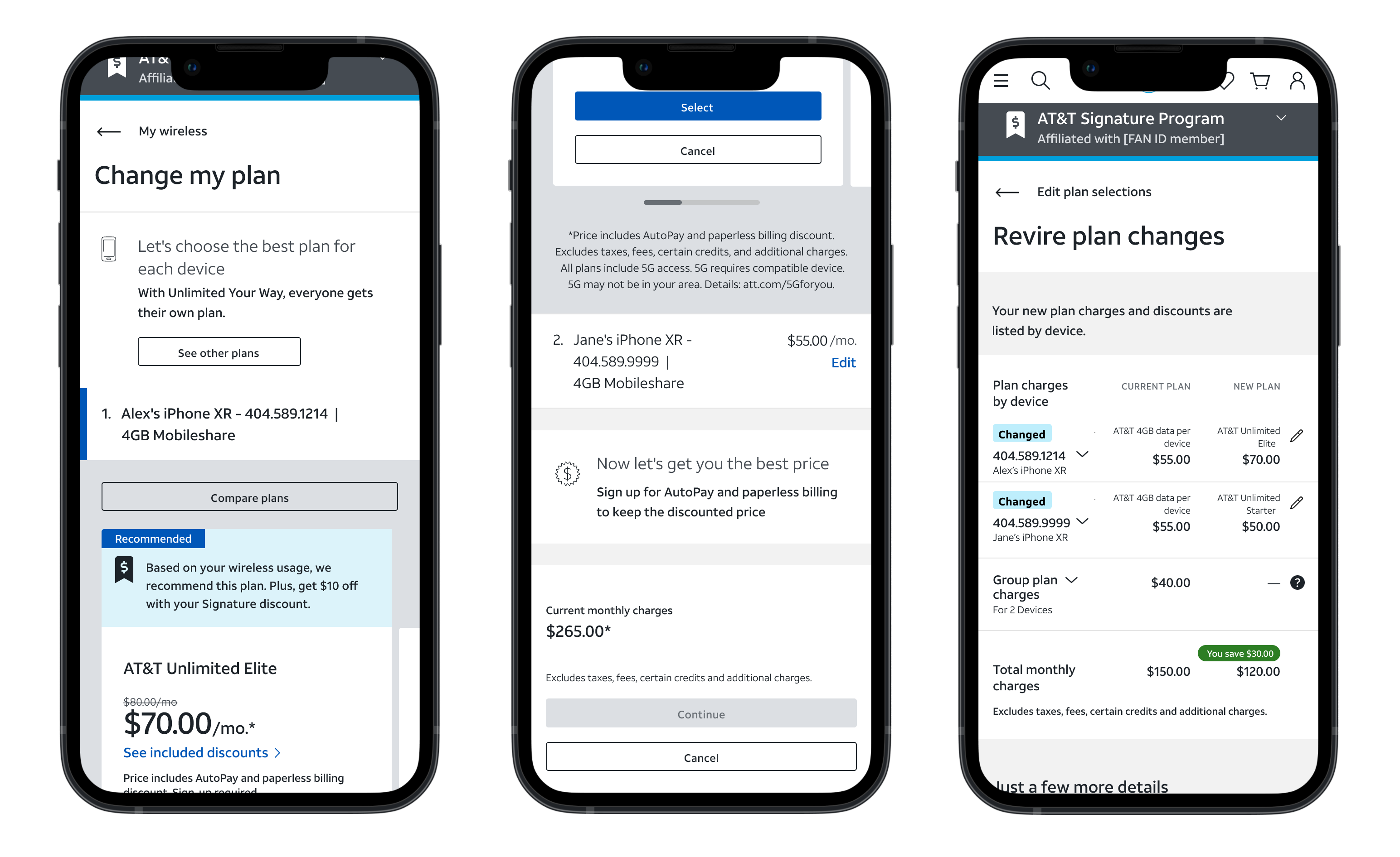
These are some screen shots of the existing change plan experience. In this use case, customer’s existing plan is a group plan (everyone in the account gets the same plan) and AT&T’s latest in-market plans are all line level plan (every line gets to pick a different plan). This creates a major friction point for the customers because most people are not familiar with the concept of line level plans. Moreover, the existing UI and UX do not do a good job guiding customers to understand how the new plan constructs work and how to move forward.
New guided flow
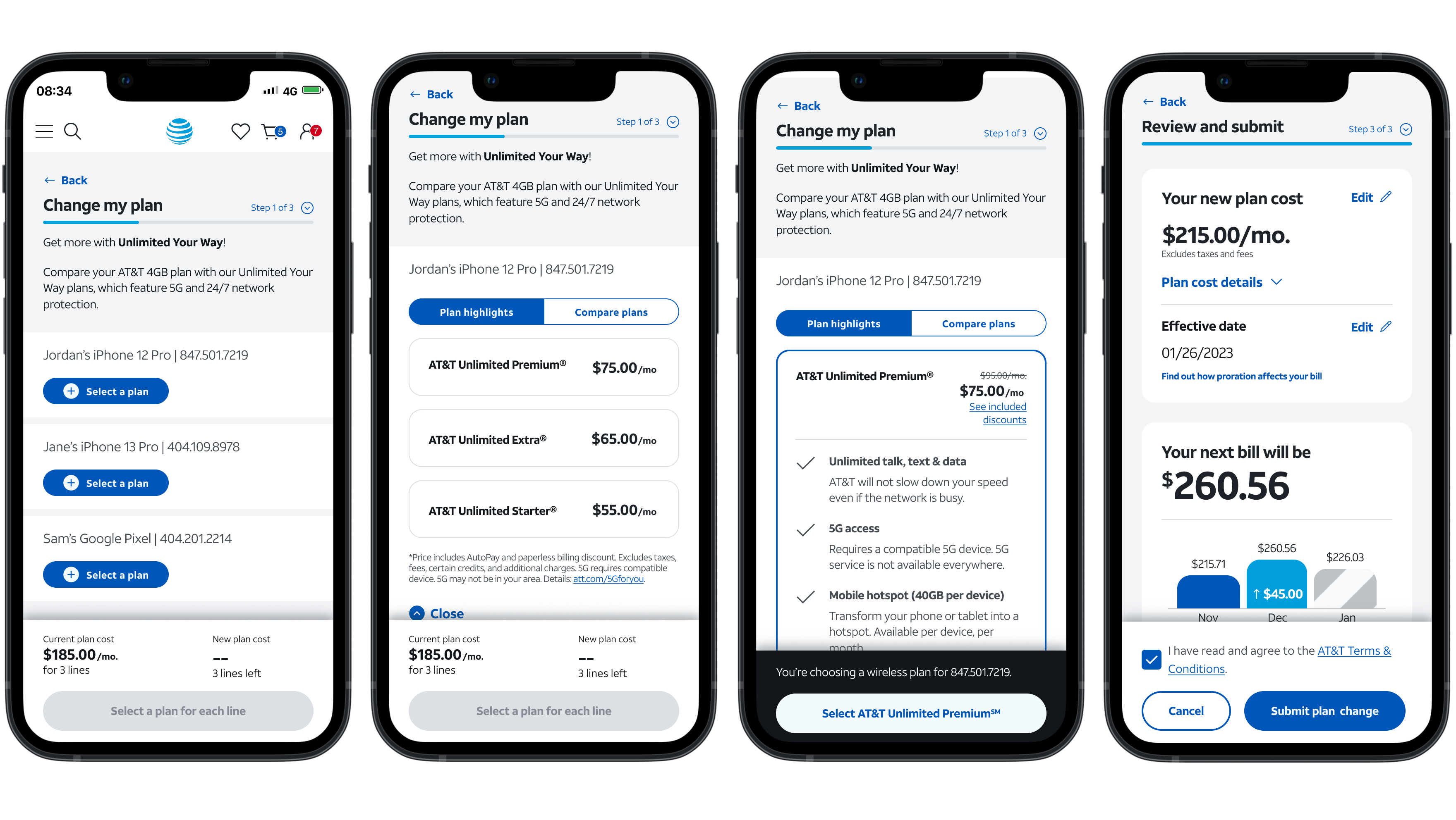
For the redesign, my strategy was to create a guided flow where the customer would need to process only one information at time through progressive disclosure approach. As they interact with the information in front of them, they will be given new information to make a new decision – presenting the right information at the right time. This way people never feel lost or confused, instead, they feel empowered and in control. This approach also allowed us to the UI very simple and clean. We used a fixed footer with consistent purpose throughout the flow to further enhance user’s experience. With many rounds of testing, we were able to iterate on the design and contents to makes sure we clearly communicate with the customers and set the right expectation. This flow is in-progress right now and will be launched by the end of 2023.
Variations and Complexities
When designing for a complex system, we must constantly ask ourselves “who is it for”, “what is their expectation/what do they want to do”, “why are they here”, and “what do they need to do to be successful”. And the answers for these questions might be different for different people. That is why software design / system design becomes extremely complex quickly. This is a screen shot of what I prepared for the development team to hand over to demonstrate how this part of the experience would change based on the different use cases.


