Overview
McClatchy's subscriptions are managed by two different systems from two different vendors. One system to manage to print subscriptions another manage digital subscriptions. There are legacy and logistical reasons for keeping the two systems. However, print subscribers need to make a digital account to be able to get full access to any of McClatchy's websites and Apps. This requires them to maintain two separate accounts. Also, some of these print users cancel their print subscriptions and become digital-only subscribers, which further complicates the matter. Oftentimes, it's very difficult for users to navigate between the two systems and be able to do what they intended. Needless to say, the disconnect between the two systems creates massive UX issues.
I was tasked with understanding the technical difficulties involved with connecting these two systems through APIs and to propose a solution to address the existing pain-points.
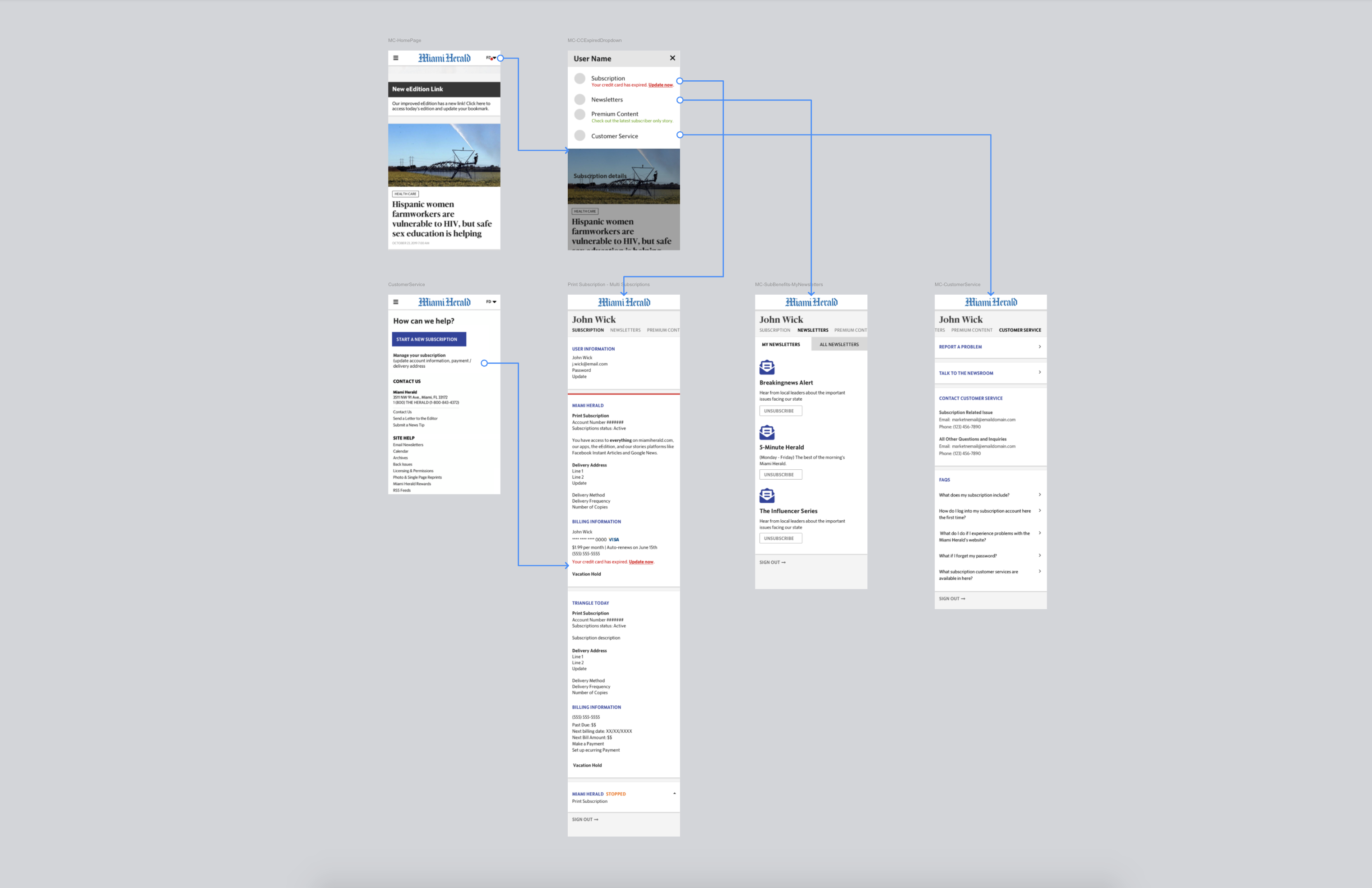
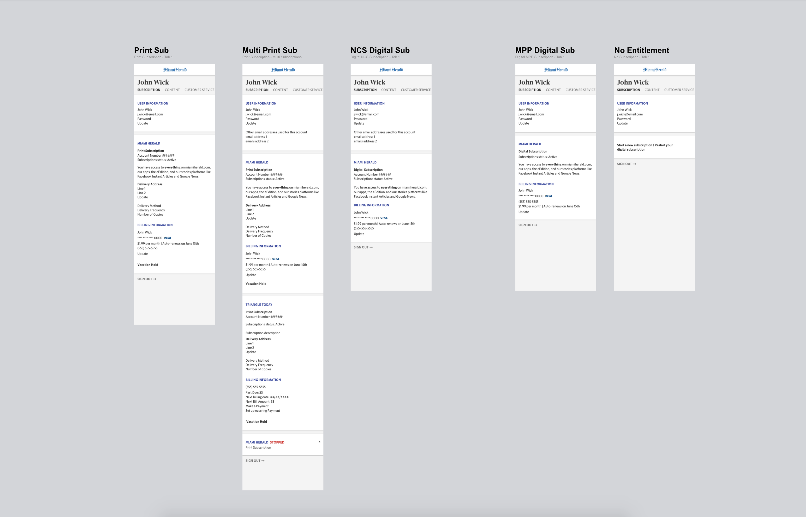
After talking to many different people responsible for all the different pieces involved in these two systems, I recommended that we invest in a single sign-on to automatically sign users in when they sign in to any of the systems. This would allow us to build a lightweight vendor-agnostic member center page that makes API call to both systems and displays only the information that's relevant to the user's account and subscription type. Users wouldn't have to maintain the two different accounts and will always be able to see information relevant to them in one central place. I analyzed all the data points we have between the vendors and architected a page that would work for both systems and provide all users a consistent experience.
Pain-points
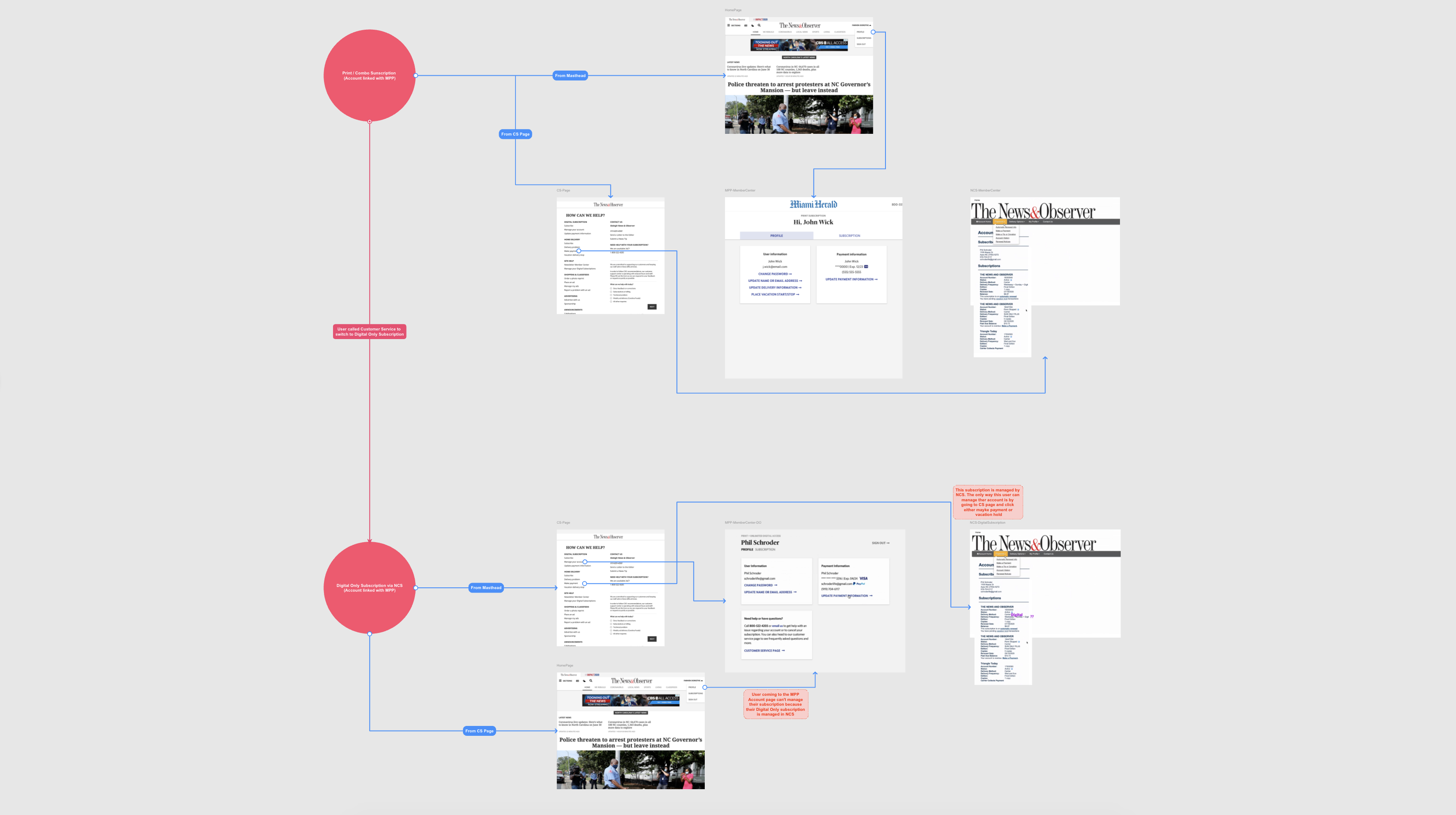
The image above documents the old user journeys where depending on where the user is, they would be taken to a different account management page. For example, if the print subscriber goes to the accaount management page from the main masthead then they will be taken to the digital vendor page. They won't able to manage any of their account related information. Where as, if they click on the account managemnt link from the customer service page, they would be taken to the print vendor page.
The vision
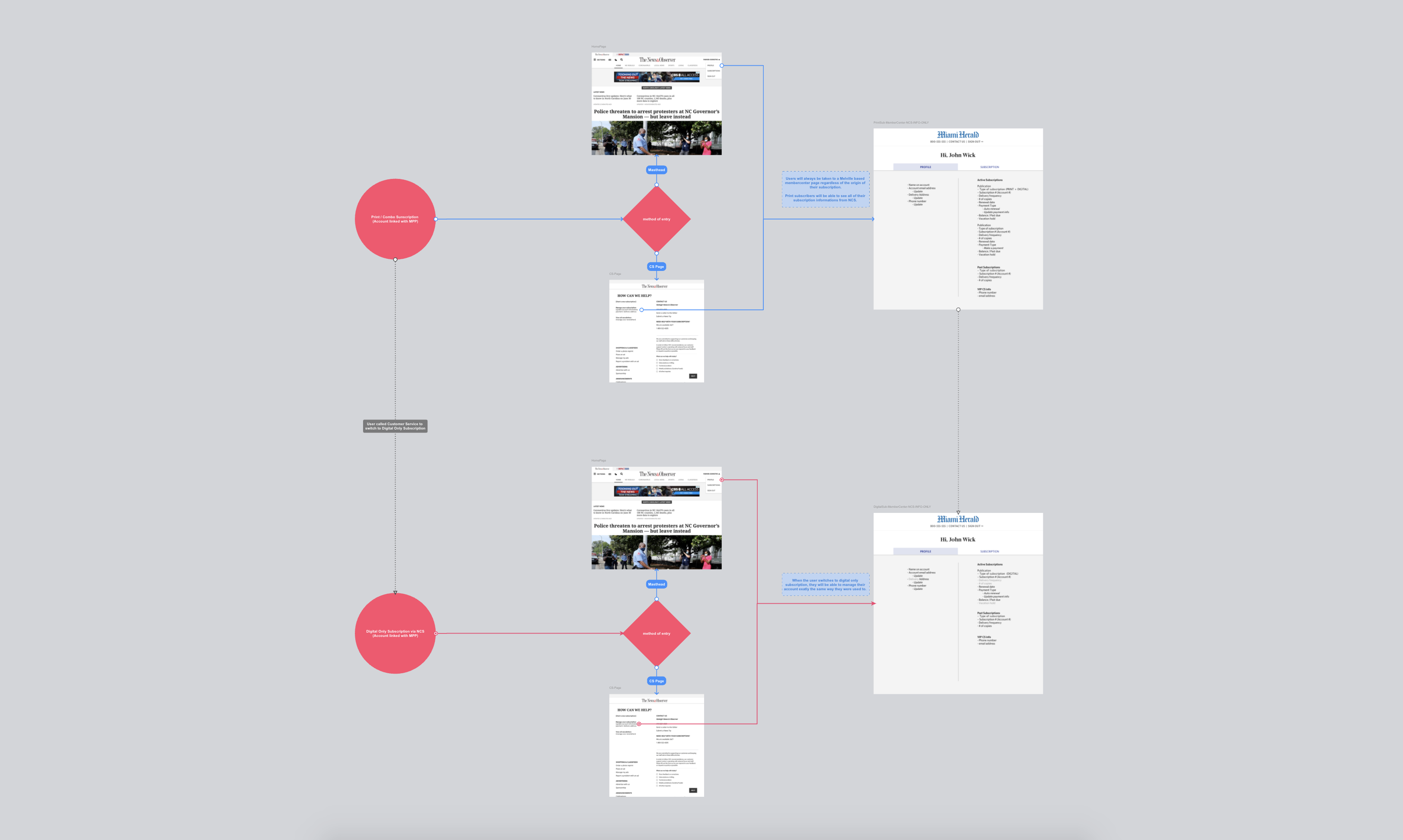
After many meetings, interviews, and learning a whole lot about business rules and many APIs, I drew out a very simple low-fi flow diagram to help me get buy-ins from all the stakeholders. This allowed me to have conversations with different teams and encourage them to take ownership by involving them in the design process. This overly simplified flow created a frictionless experience for our users by removing both vendors from the frontend. Users would only see an account page that would be hosted in McClatchy's system and it would be connected to the vendors via various API calls. Users would have to go through a required one-time set-up process for all these connections to work.
The New Journey
Dynamic Account Page


