Overview
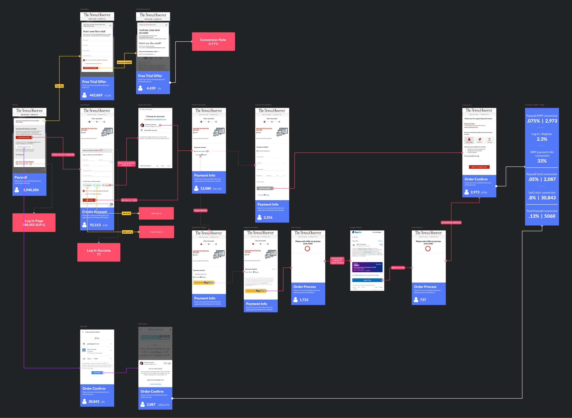
One of the first things I have done after becoming the Senior UX Designer at McClatchy is to document the existing user journeys of a few different areas. I especially focused on the paywall meter, purchase flow to become a subscriber, subscriber onboarding, and the overall subscriber's experience. At the time, all of this information was fragmented and known to only a few people. By putting them all together in one place in a very visual and digestible form made it easy for everyone to understand how things are connected and identify pain points. Therefore, it also became easy to figure out the opportunity points. These user journeys became instrumental to get stakeholders' buy-ins for many future projects.
User Journey Example
This is an example of McClatchy's subscription purchase flow. I not only documented what the user journey looks like but also used Adobe Analytics to figure out exactly where people drop off.
Iterative Improvements
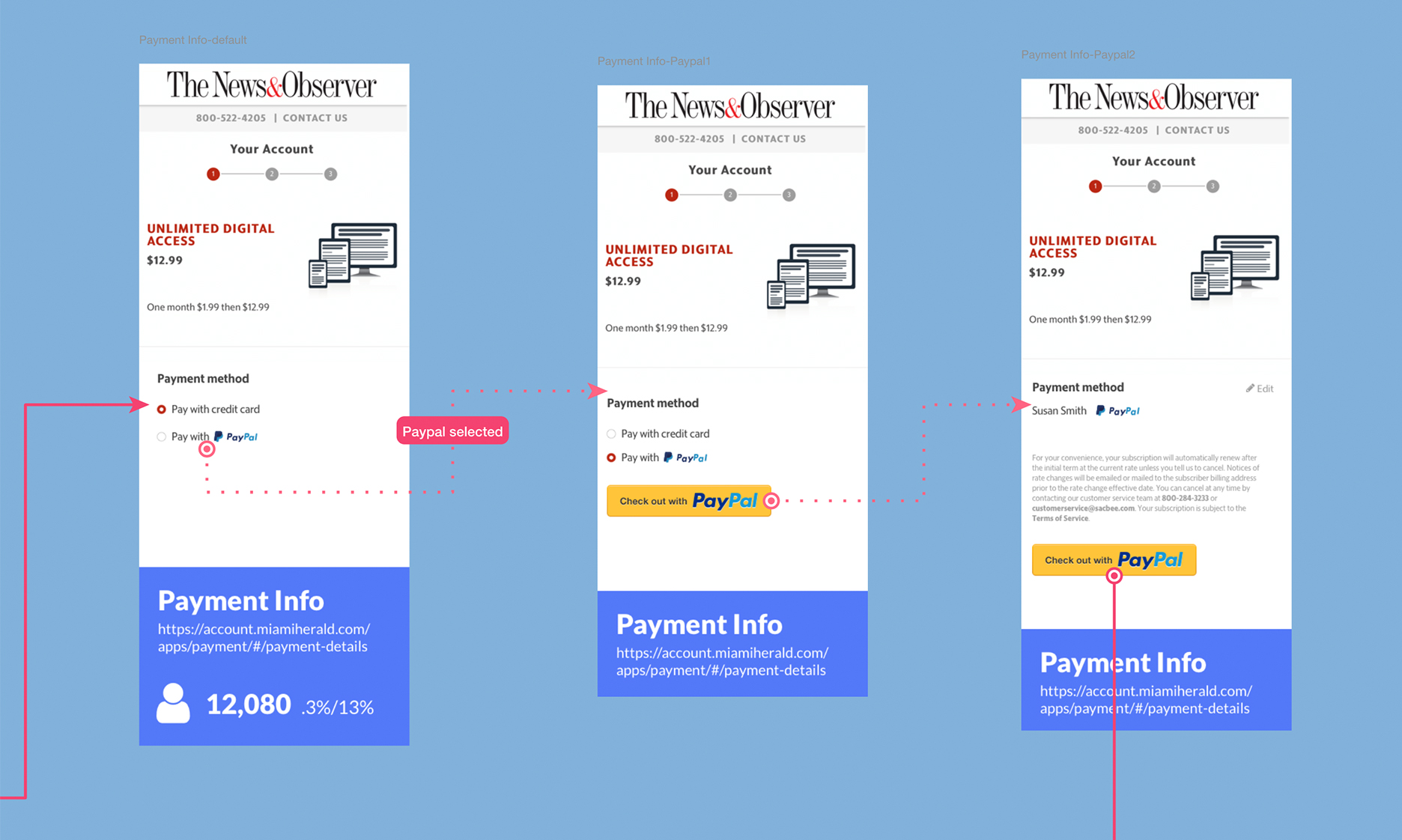
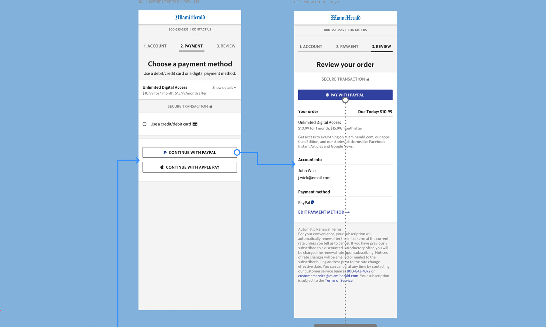
While documenting, I've also identified many pain-points and recommended solutions to fix them. In this example, I noticed a confusion point for the users using PayPal as a payment option. I recommended that we change the layout and the UI of PayPal as well as improve the "order review" information for the PayPal users. It has allowed us to minimize one of the screens and provide a much better user experience.
Big Changes
These documentations provided a source of truth for everyone and helped bring forward many usability and experience related issues. They played an essential role to create product roadmaps and prioritization. This is a perfect example of that. In 2019, I documented our existing user journey for new subscribers. I pointed out there was some confusing language in the transaction emails that needed to be adjusted. This reached out to the leadership team and the team responsible to make the changes. I gave them my recommendations and we were able to change the language in the emails within a few weeks.
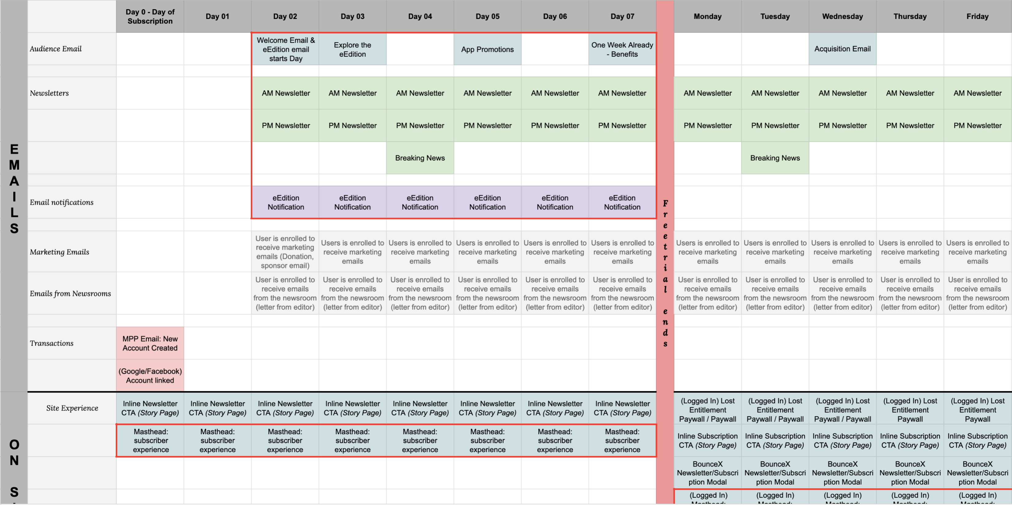
We've also conducted a Diary Study and a complete product analysis using Adobe Analytics to understand the performance of our onboarding emails. At the end of those two research projects, I recommended that we change the content within the onboarding emails, the order of those emails, and reduce the total number of emails. We decided to only sign new subscribers up for one newsletter instead of two newsletters. We also decided to hold off all marketing and sponsored emails for the first 21 days of their subscription. This would allow users to only focus on learning everything their new subscription has to offer.
Collaboration
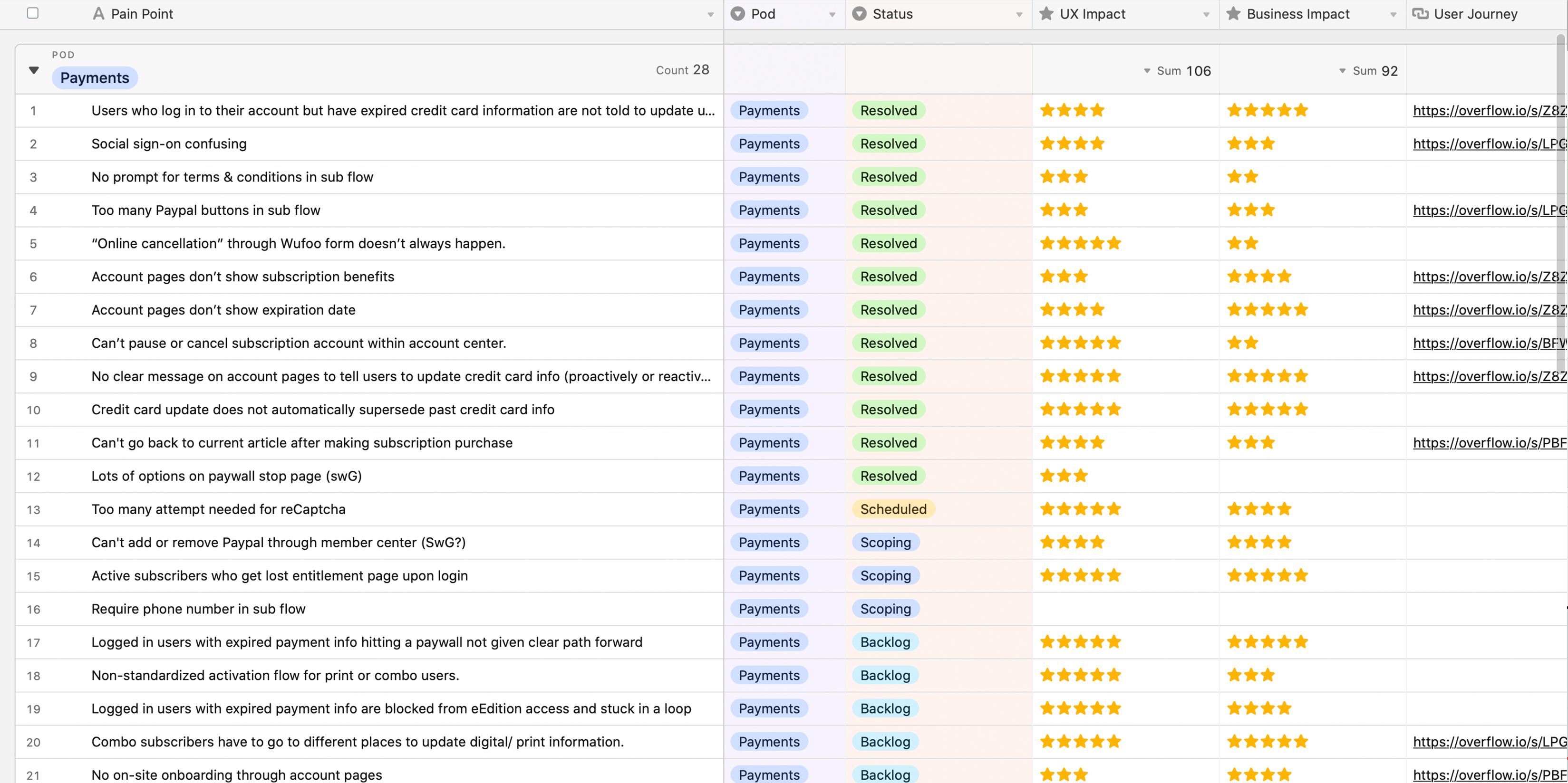
In the process of making these iterative improvements, I realized Overflow prototypes do not always encourage collaboration from non-designer team members and stakeholders. That's why I often create a simple Google Sheet with the current customer touchpoints and work with stakeholders across departments to improve the user experience. I also keep a running list of issues I find using Airtable. I work with a small group to evaluate their UX value and business value in order to help the leadership team to prioritize.
