Overview
McClatchy is one of the oldest local-news media companies. Currently, they have 30 news markets across the United States. Before the redesign, they all shared the same web templates for their main websites. I was the lead designer to revamp the website template for all 30 markets. There were about 50 to 80 million people visiting these sites in a month at the time of the redesign. Also, one of main revenue sources for the company was digital ad and digital subscription from the website of these 30 markets. Therefore, needless to say, everyone in the company was a stakeholder.
Immediately after starting the project, I realized that a complete redesign of the template would require a new ad-map and new revenue modeling. We would also need to provide training to the editors and journalists in the newsrooms because content architecture would need to change. This caused a lot of anxiety across multiple departments.
This forced me to leave my bold ideas to the side and think about ways to redesign the template in a way that won't cause any pushback from our colleagues and won't require massive revenue infrastructure changes.
Before the redesign...
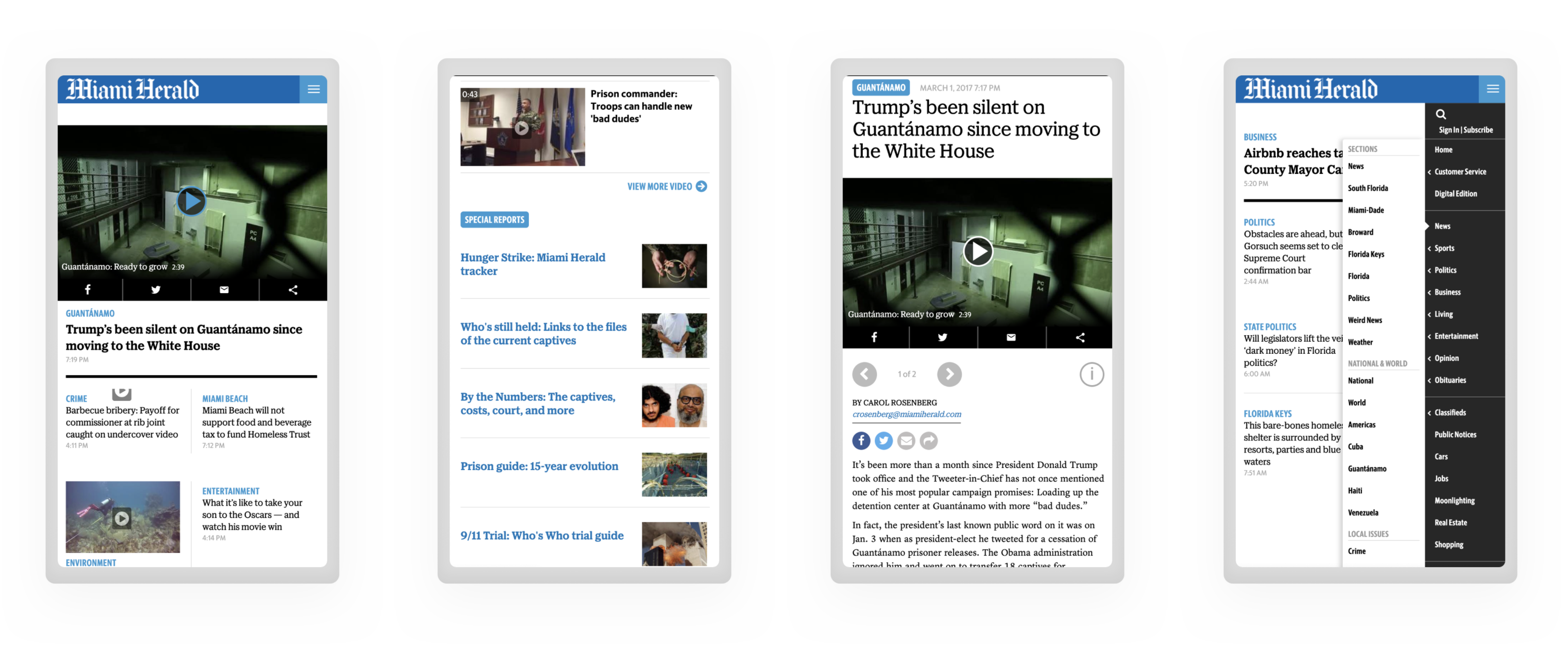
The old template had many obvious issues like inconsistent UI patterns, too many font styles, and a general outdated feeling. However, the bigger issue with this template was it was pretty much a static page. That's why, for phase 1 of the redesign, we decided to keep the overall page architecture the same and focus on updating the design by adopting a modular design system, creating a style guide, and making the backend dynamic. By doing these, we would position ourselves to create specific and personalized experiences for different user segments and experiment with small and iterative layout changes over time. This would also allow us to keep the amount of ads in each page relatively the same.
The Process
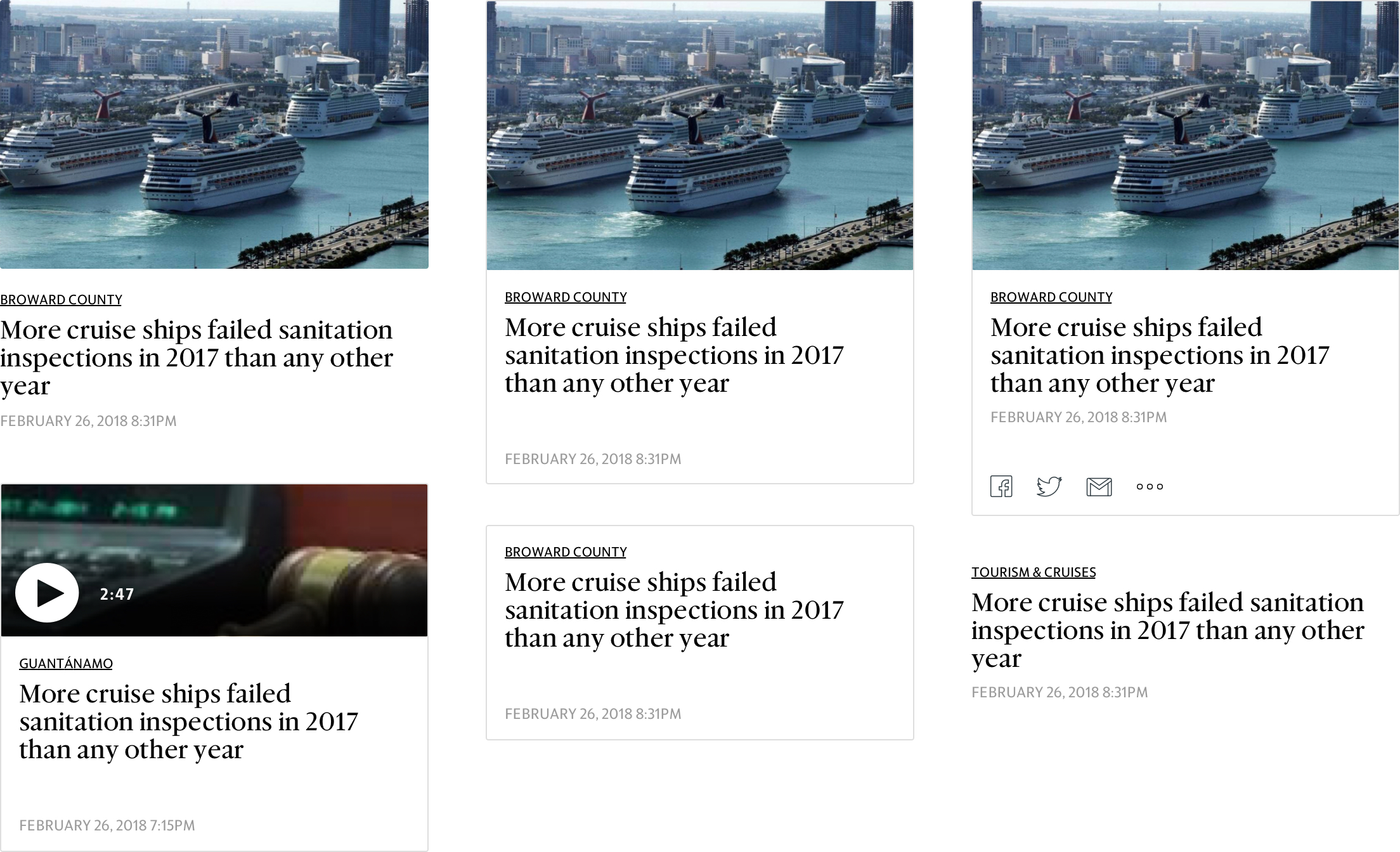
Once the direction was set, I immediately started experimenting with different card styles. The image above is showing examples of some of the designs I was trying out. I tried various image sizes, font sizes, border/shadow styles, amount of white spaces, and social icons. At the end we went with a version of the upper-middle design. Regardless of the length of the headline, this card creates a perfect grid and minimizes weird white spaces between the stories. It also works well without any image. This card later became the most fundamental element of the new template.
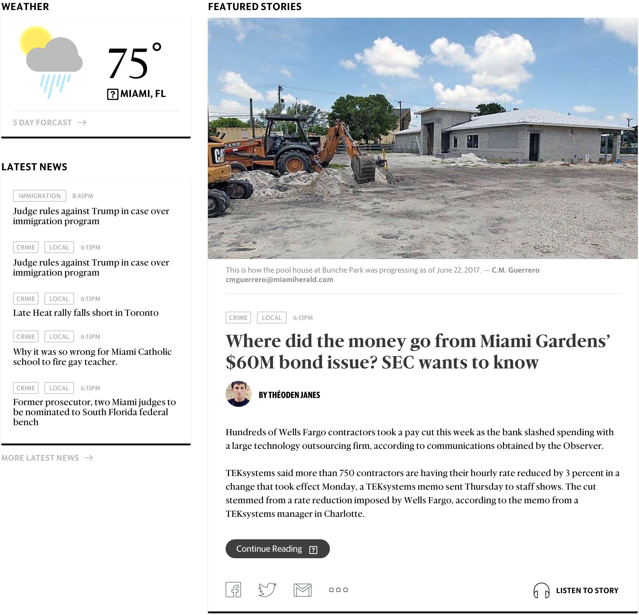
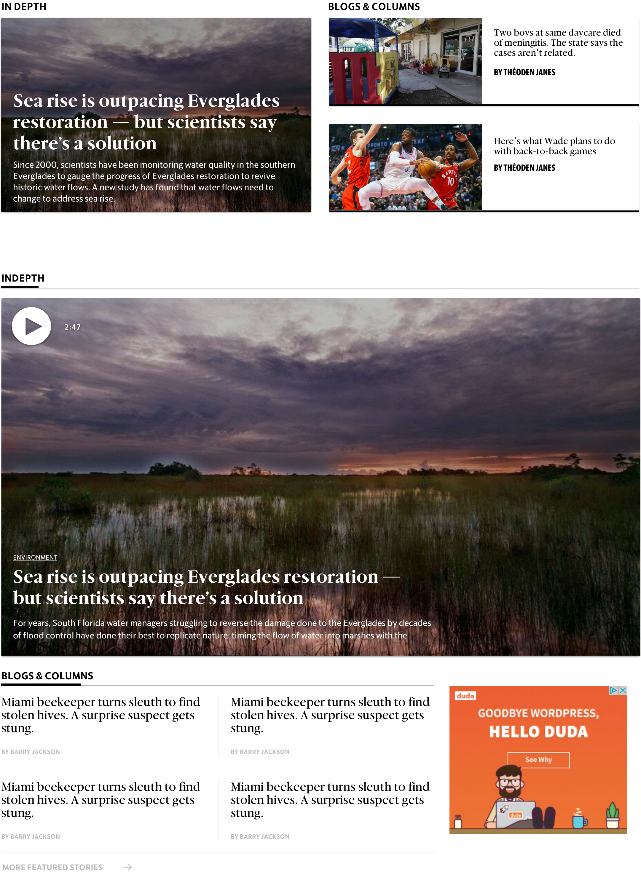
At the same time, I also started designing different layouts for more featured stories. In order to create a more immersive experience, I tested both an image based design and a text based design.
Final Designs

I utilized some very simple UI elements to construct the entire template. I created two main cards and a few variations of each of them to essentially create the entire template. This forced me to keep the UI elements to a minimal and resulted in a cohesive and consistent experience in all the pages. I also kept the page architecture almost exactly the same with a few small changes. One of the main changes was to move the "Latest News" module to the left (it was at the right side of the main story in the old template). I did that based on some research and onsite user testing results. From the testing it became evident that the list was much more prominent and gets people's attention much faster when it's positioned to the left. It was specially true for frequent returning visitors.
Countless pages and UIs had to be designed for this project. I am linking a few here that were past of Phase 1.Desktop Designs | Mobile Designs | Immersive Story | Video UI |Series of Stories
These final designs became a foundation for all the future iterations and improvements for all of McClatchy's products. I worked very closely with the system architects, front-end and back-end developers to design this modular web template that allowed data-driven content and subscription strategy to provide the best user experience possible for all different target audiences.
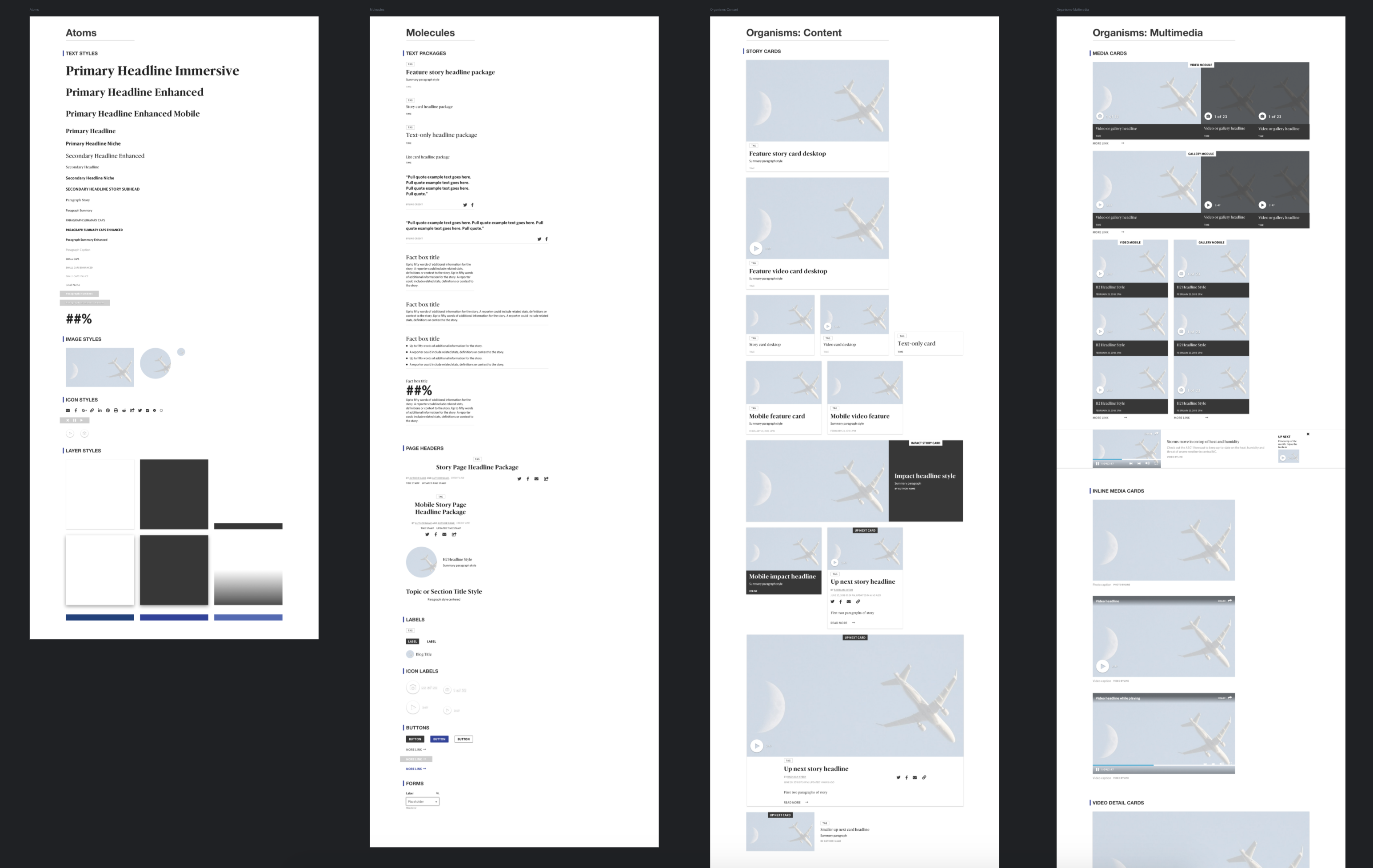
Atomic Design System
Another goal of designing this modular web template was to create an Atomic Design System that would be used across all products and serve as the Style Guide for the entire business. I used Sketch to start building all the different Atoms and Molecules and would make up the Cards (Organisms). A junior designer later helped to complete the design system. However, we quickly realized that just having a Sketch file of the design system didn't help our front-end developers as much as we hoped. Therefore, we started a "living" version of the style guide. This guide has been serving as the source of truth for design for a few years now.
