Newsroom platform, McClatchy
More than thirty newsrooms published on one template. I redesigned it, built the design system underneath it — and then used that system to fix the moment readers needed their local paper most.
- Role
- Lead designer
- Team
- One junior designer
- Year
- 2018
- Scope
- Site template redesign, atomic design system, breaking-news escalation
One template, thirty newsrooms
Every McClatchy newsroom published its website on the same template, and no two of them had the same resources.
The Miami Herald could staff a major story with a team producing updates, video and related coverage all day. A small paper might have one or two people covering the same event while everything else still had to get done. One template had to serve all of them — which meant a design built for the Herald would fail most of the company, and one built for the smallest paper would waste what the larger ones could do.
The system underneath
A template for thirty newsrooms is really a set of parts, so I redesigned it as one.
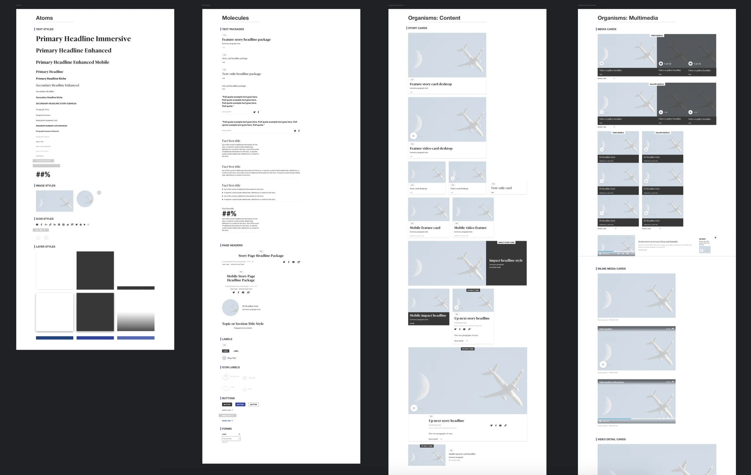
I built an atomic design system first and assembled the new template from it. Atoms were the type, image, icon and layer styles. Molecules combined them into headline packages, page headers, labels, buttons and forms. Organisms were the parts a page is actually made of: story cards and media cards. Every newsroom got the same parts, which is what made the template consistent across thirty sites — and, as it turned out, what made the next project possible.
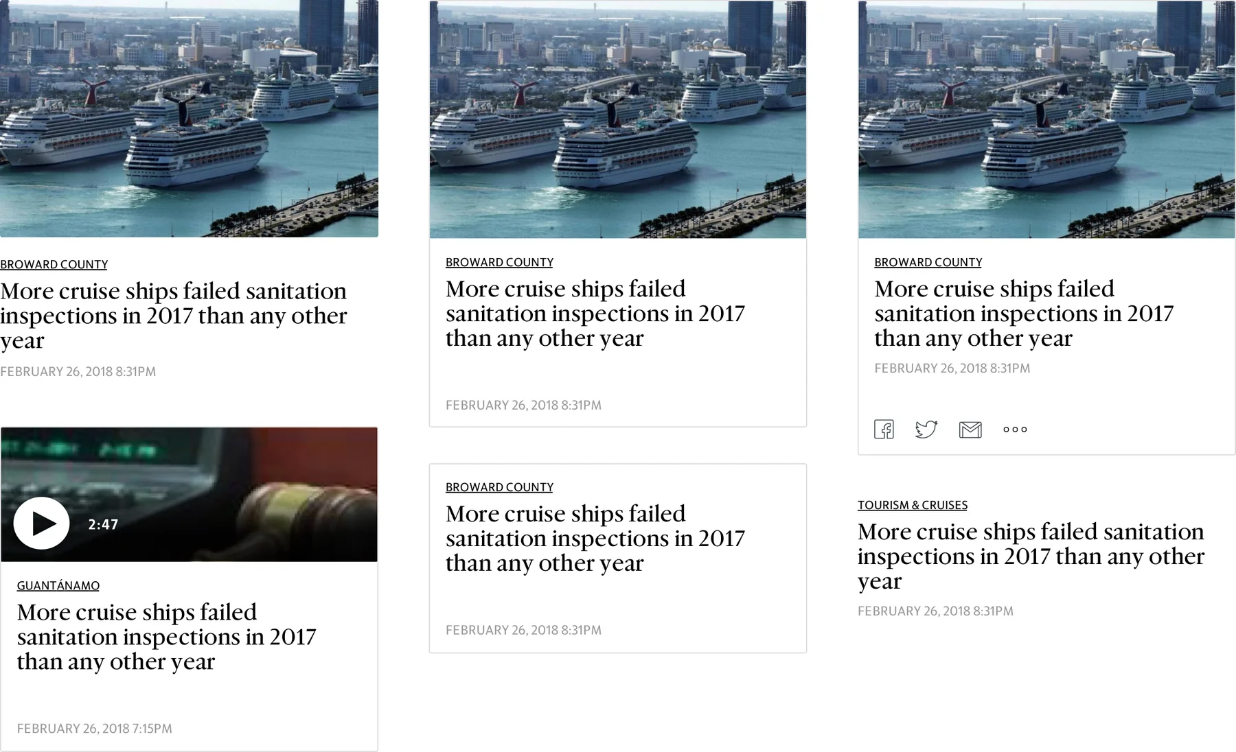
The payoff shows up at the level of a single story. One card could run with an image or without, as video, with sharing, or as text alone — so the same story could be given whatever weight a page needed, from a lead to a line in a list, without anyone designing anything new.
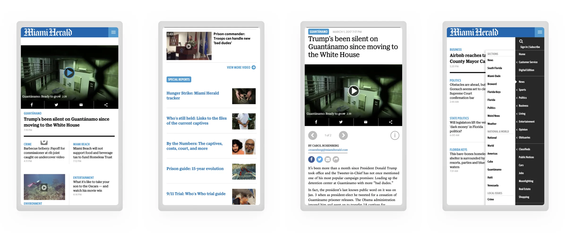
The homepage was the first template built from those parts.

The story kept changing
A local news site sees its readers most often during a developing story. It is exactly when the homepage served them worst.
The reporting was being updated constantly. The homepage was not. A reader checking in for the fourth time that morning found the same page and the same headline, with nothing to say whether anything had moved on. Most did not click through to find out.
So the newsroom’s most important work was happening where the readers most interested in it could not see it. Big news events was the first thing I built on top of the new system, as an enhancement to the template.
A system that escalates
Instead of one special layout, five levels — each a step up from the last, each usable on its own, and every one of them made from parts the system already had.
A newsroom picks the level that matches both the size of the event and what it can sustain. A small paper can stay at stage two all day and still give readers a clear signal. A large one can climb to stage five. Both are using the same system, and neither is being asked for more than it can produce.
One homepage, five levels of news
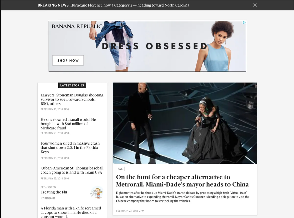
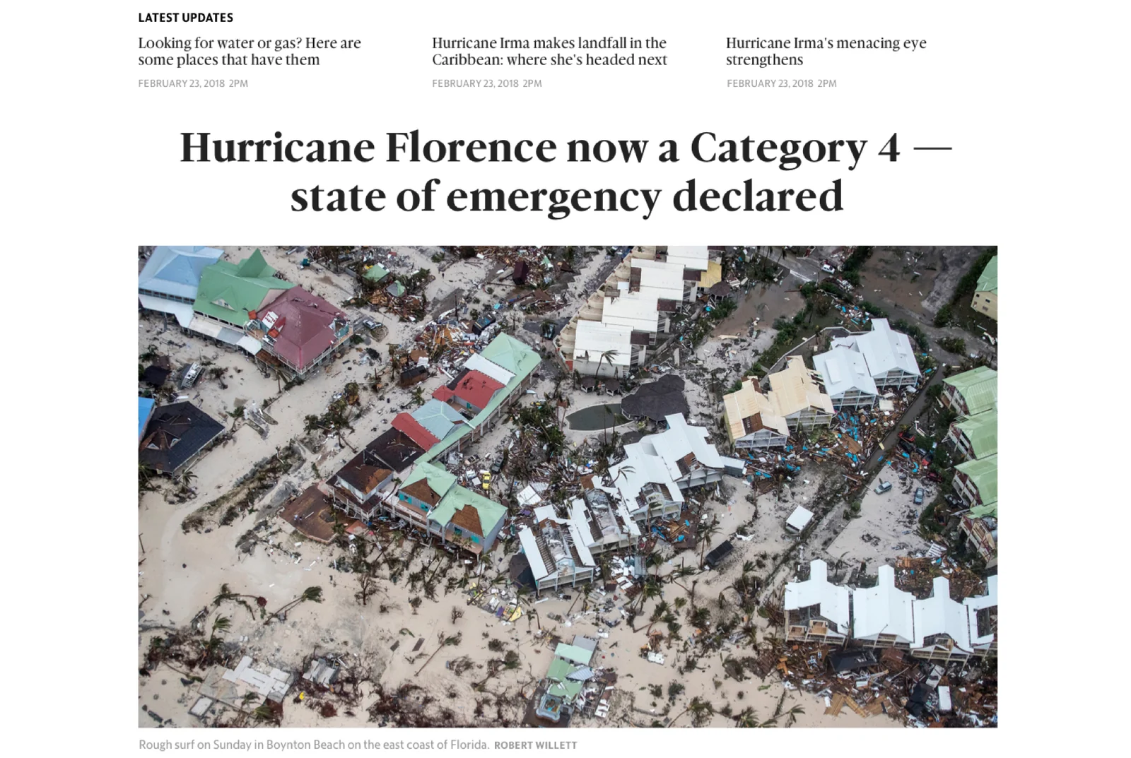
Stage three is the one that answers the original problem directly. The latest updates sit above the headline, so a returning reader sees what changed before anything else. Everything above it is capacity: more for the newsrooms that have it, nothing required of the ones that do not.
This is where the design system paid for itself. Each stage is parts the template already contained, arranged differently — even the largest: the system already carried an immersive headline style and an impact story card, and stage five is built from them. A newsroom moving up a level was not building anything or learning anything. It was choosing how much of what it already had to show.
Where it landed
The template shipped across McClatchy’s newsrooms, and big news events ran on it for years.
Longevity is the result I would point to. A layout designed for one event gets used once; a system that newsrooms of every size keep choosing, event after event, is one that fit how they actually work. And the order mattered: the escalation model was only cheap to build, and free to use, because the platform underneath it already existed.