Offer clarity, AT&T
Every promotion in the catalog spoke its own language. To work out which offer they qualified for — and how to claim it — customers had to read the legal copy.
- Role
- Lead product designer
- Team
- PM, research, content, two engineering teams and architects
- Year
- 2025
- Scope
- Offer assessment, scope definition, pattern design, cross-platform alignment
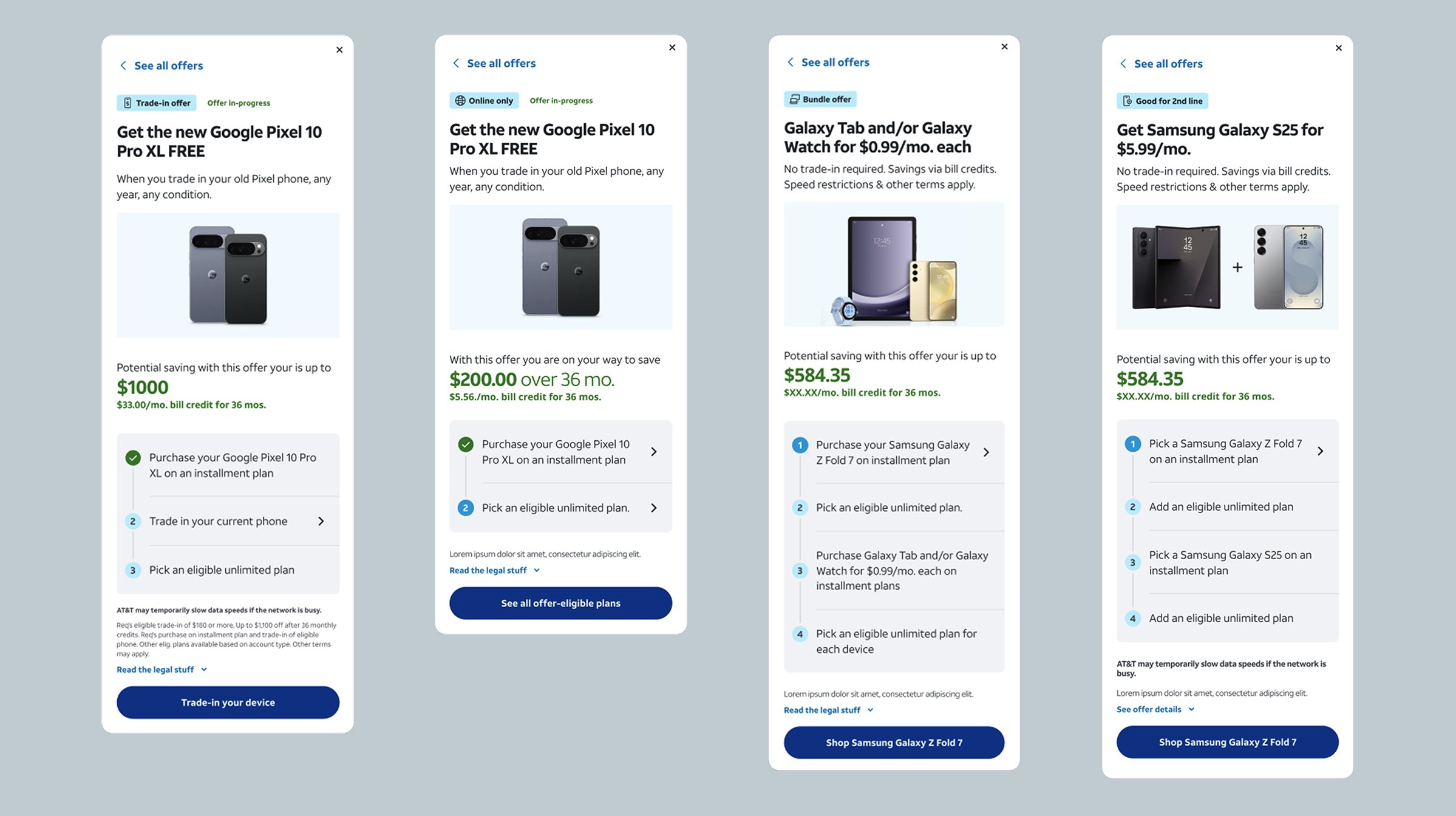
The ask
The brief was one line: make offers less confusing. Not a page, not a feature — offers, wherever they turned up. No definition of what less confusing would mean, no agreement on which offers were in scope, and no single team that owned the answer.
The confusion had a specific cause, and it was not the writing. We knew who each customer was — their plan, their device, how long they had been with us, what they were eligible for. We showed all of them the same offers anyway.
Qualification was never stated on the offer. It was buried in the terms attached to it. So the only way to find out whether a promotion applied to you was to open the legal copy and work it out yourself — which meant the personalization we already had was doing nothing for the person who needed it.
Where it broke
So I stopped auditing offers surface by surface and traced them end to end instead — many of the live offers, followed through their full journeys on test accounts and on my own, to see what a customer would actually be told at each step.
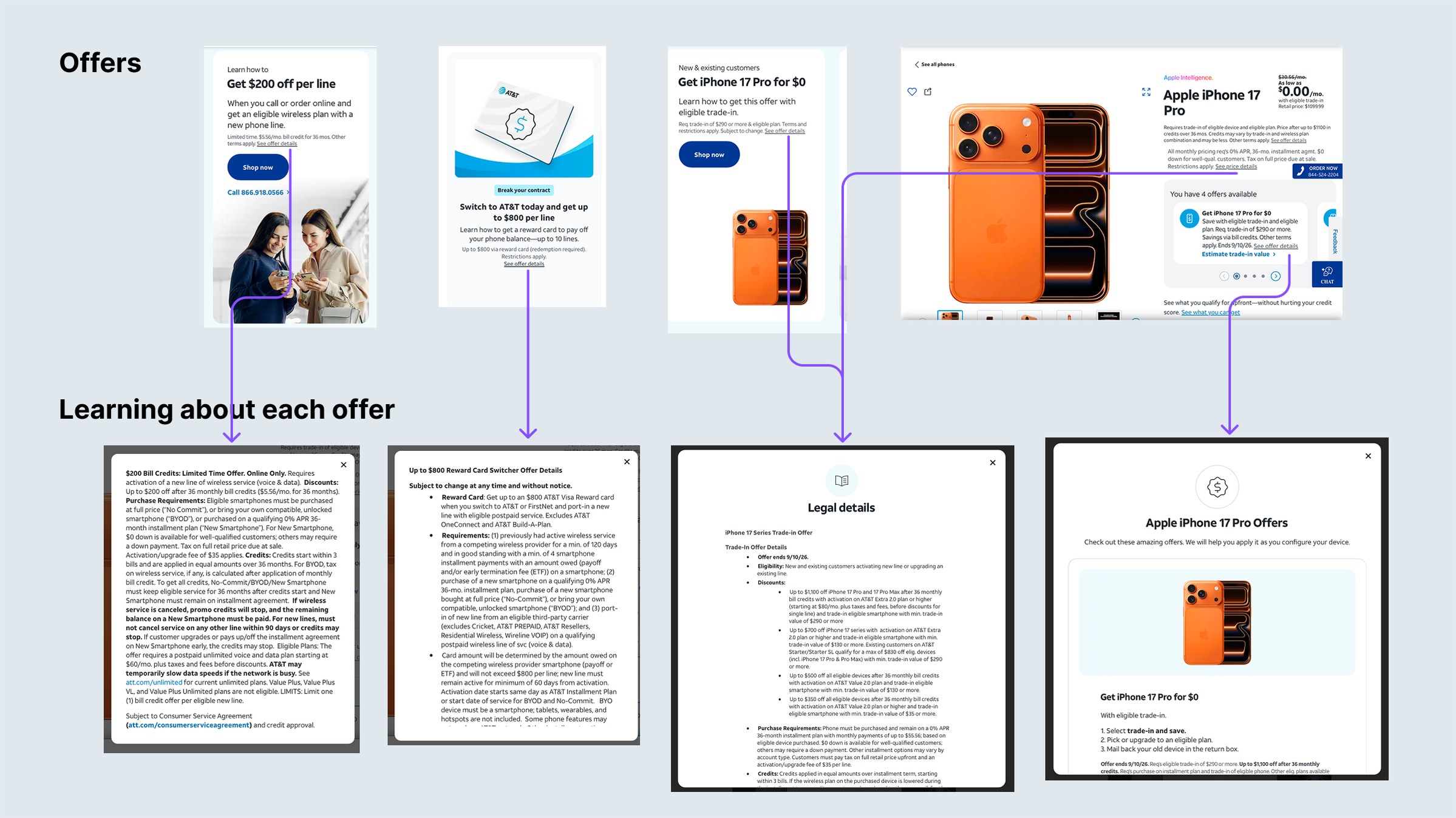
The prices did not survive the journey. Nothing was hidden — every number was disclosed somewhere, and the legal panels were accurate — but no two surfaces agreed, and the only one that counted was the last.
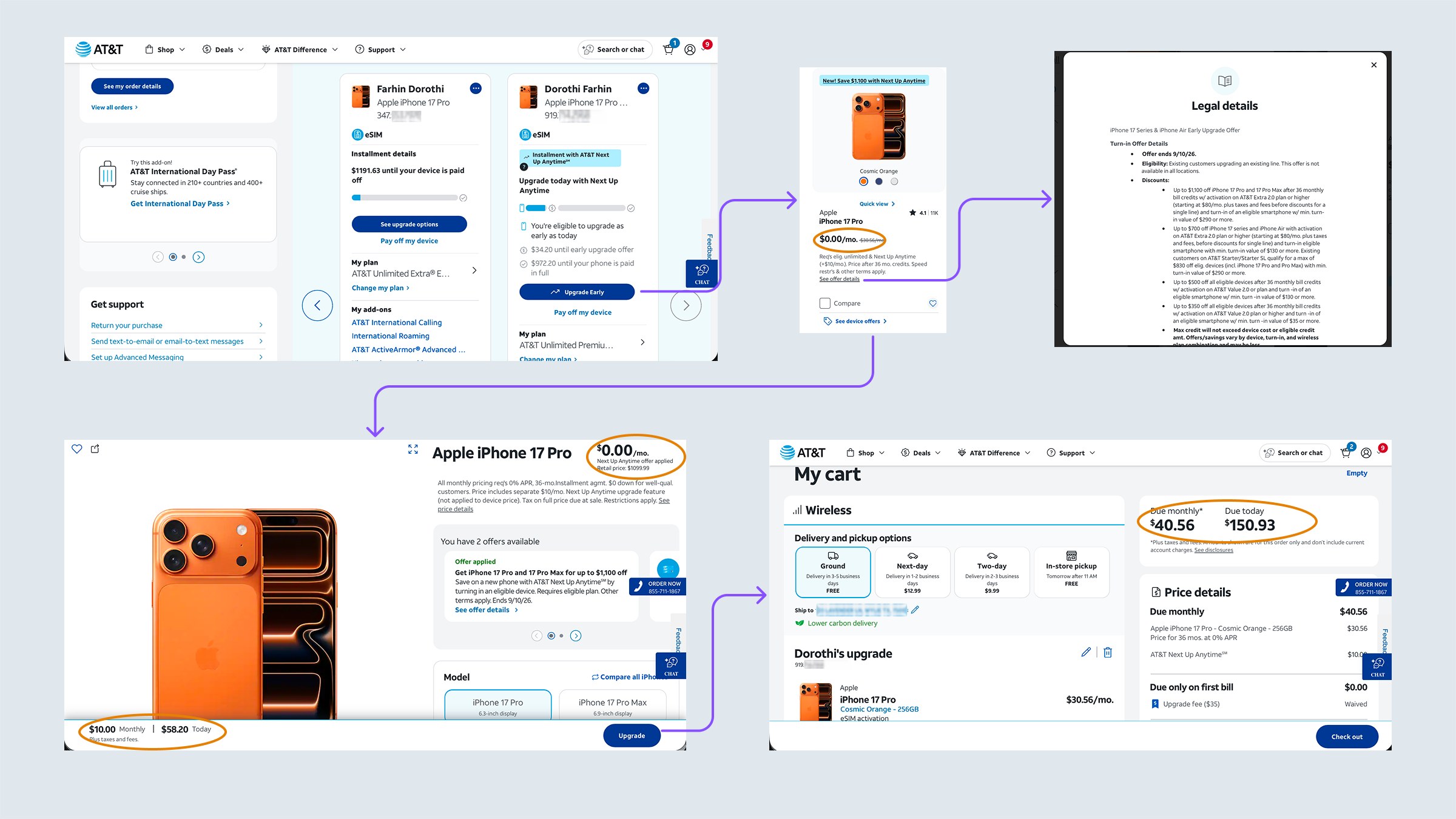
Upgrades were only one of the two ways this broke. A new customer who chose a plan the offer did not cover was never told. The offer stayed on screen, still looking applied, through plan selection and add-ons, all the way to the cart — where the price quietly corrected itself.
Both failures had the same root. Eligibility was resolved once, at the cart. Everything before that was a promise the system had not checked.
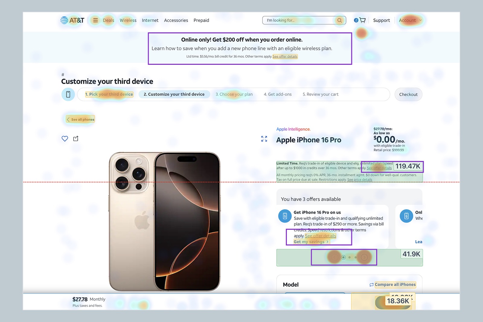
Read on its own, the heatmap says one thing plainly: people wanted the offers. Every surface that mentioned one drew engagement — the banner, the offers module, the carousel, and the see-offer-details link tucked inside the legal block, which pulled 119.47K clicks in seven days on its own.
That is not the behavior of customers ignoring promotions. It is customers working to understand them. And the work was real, because the page gave them no map: several distinct offers sat alongside duplicate routes into the same terms — Limited time and Get iPhone 16 Pro on us resolve to the same legal copy, the online-only banner to something else entirely. Nothing on the page told you which was which.
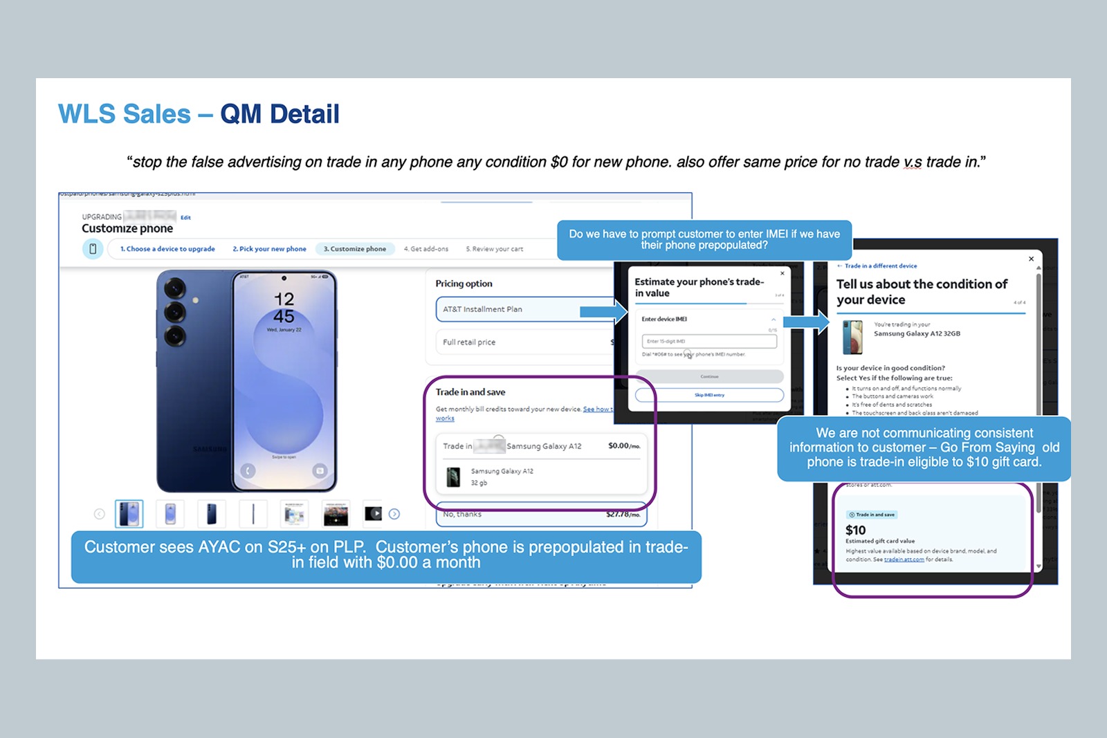
“Stop the false advertising on trade in any phone any condition $0 for new phone. Also offer same price for no trade v.s trade in.”
Customer verbatim, voice-of-customer programmeHow big it actually was
Once the failure had a name, the next question was how much of the estate it touched. Nobody could answer that, because nobody had mapped it.
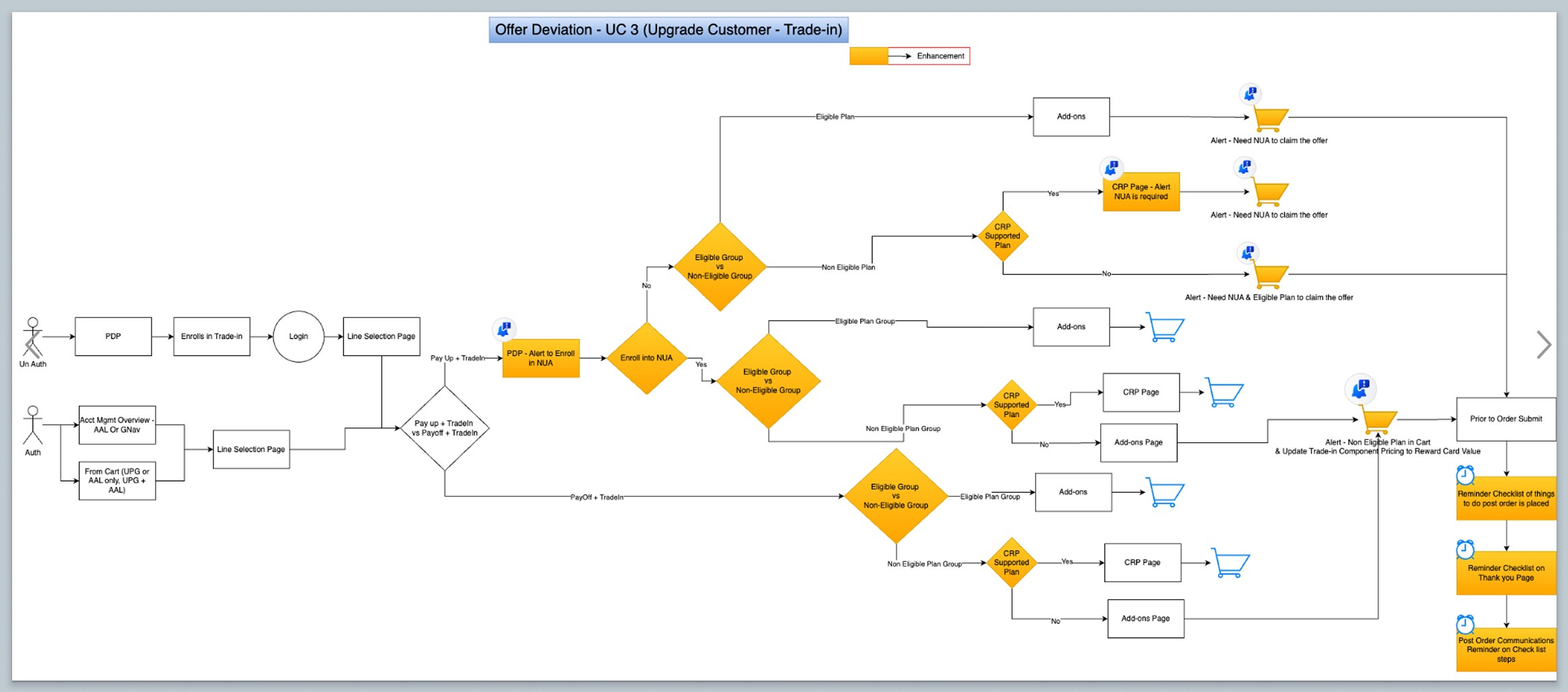
So we worked it out one use case at a time. Each model followed a single customer type — new or existing, upgrading or adding a line, signed in or not — through every point where eligibility changed what they could claim. Each one also named the pages and systems that would have to change as a result: product page, plan selection, cart, order submit, post-order communications.
The models did the thing the brief could not. They turned “make offers less confusing” into a countable list of use cases, impacted areas and system dependencies, which is what a scoping and funding conversation actually runs on. This was one of many.
They changed how the decisions got made, too. Each use case put the same three things on one page — what happens today, why that is a problem, what you want to happen instead — and we walked through them with every key stakeholder in the same room, instead of briefing each team separately. Seeing the current behavior in black and white settled some arguments on the spot. Not all of them, but enough that scope stopped being a matter of opinion.
The pattern
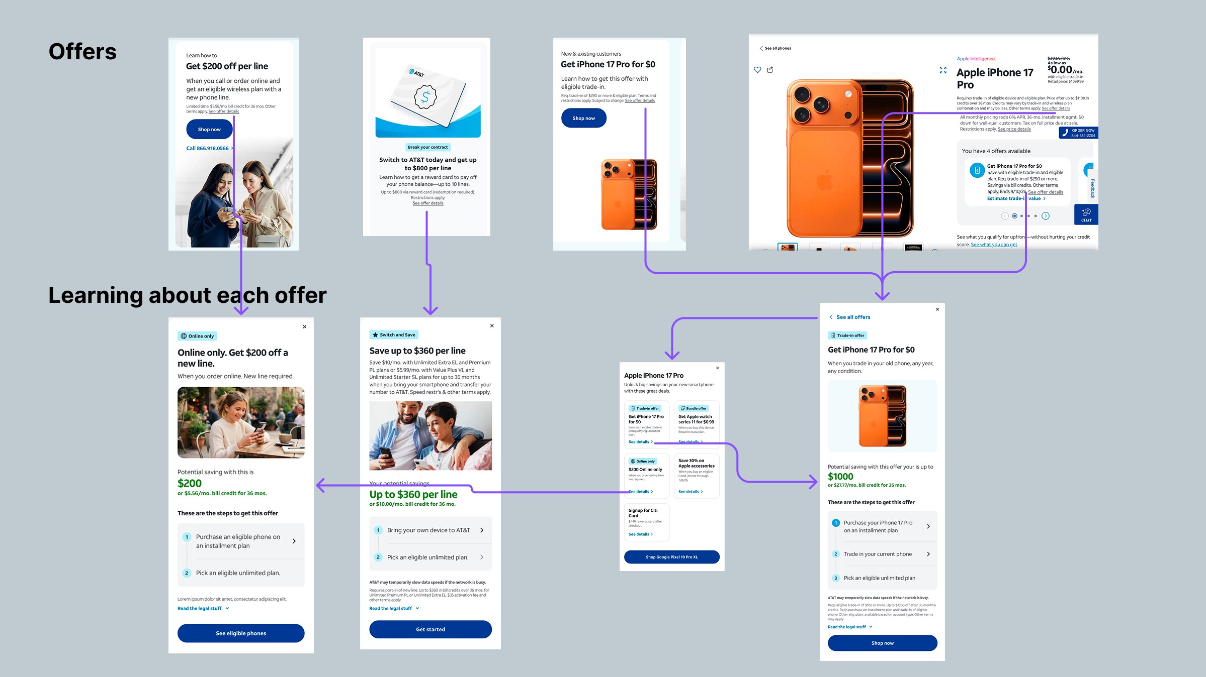
What I wanted out of the assessments was narrow and specific: one consistent way to tell a customer what they actually have to do to apply an offer.
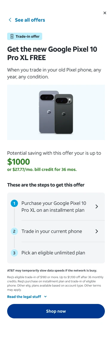
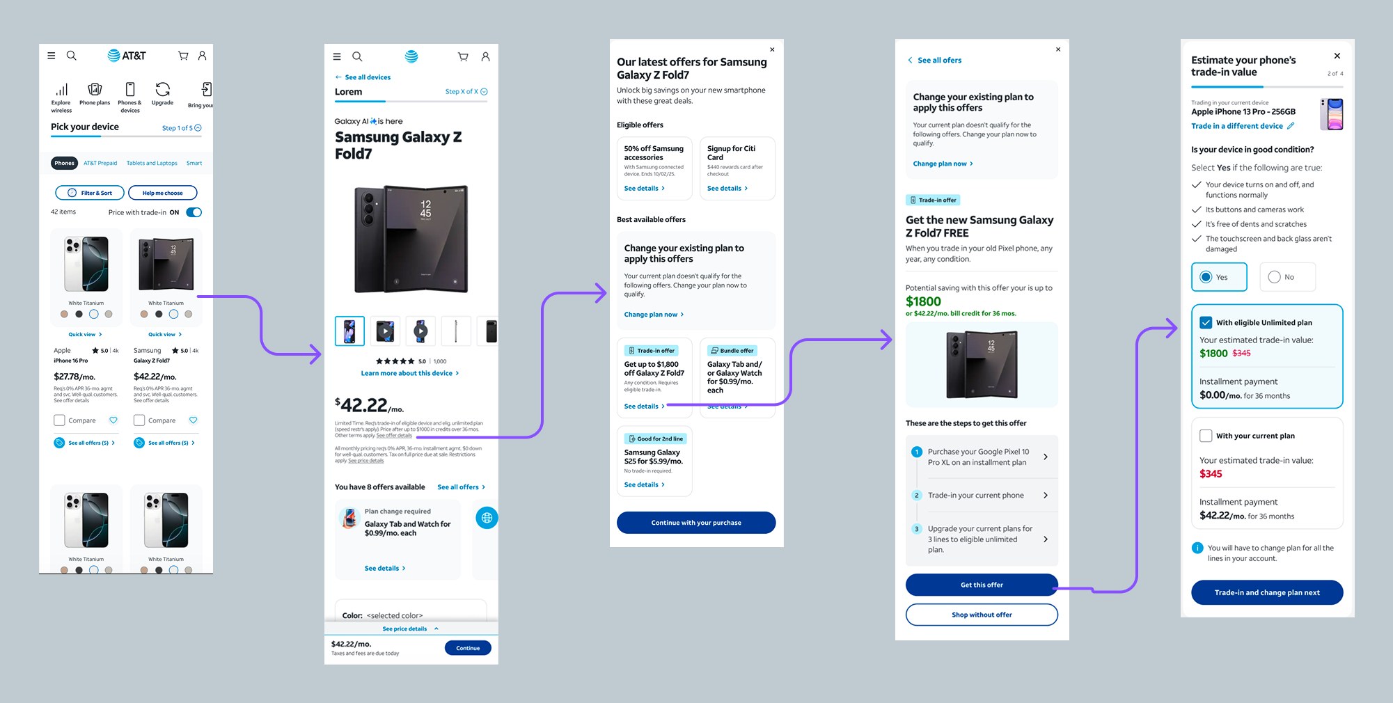
That meant showing state, not just terms. Whether an offer is partly applied, fully applied, or being deviated from — said plainly at the moment it changes, rather than reconciled at the cart.
The steps themselves come from what we already know about the customer. Someone who qualifies sees what is left to do. Someone who does not is told so — and stops being shown a price that assumes an offer they cannot have.
Every offer then follows that same pattern, so nobody has to go hunting through legal copy or a modal to find out where they stand. Upper funnel, buy flow or cart, the answer looks the same and means the same thing.
Proving it out
None of this shipped on the strength of an argument. We ran multiple A/B tests and a long run of usability sessions to settle both the experience and the interface — which offers to surface, how to state eligibility, where the steps belong, what to say when someone does not qualify.
The A/B tests moved the number that matters: among customers who clicked into the updated offer styles, conversion rose 5%. Testing against something people could actually use, rather than a description of it, is what turned the pattern from a proposal into a specification.
It also had to hold in more than one place. I worked with the app teams so they adopted the same solution rather than building a parallel version of it — same states, same eligibility language, same steps. A customer moving between the app and the site sees the same offer, told the same way.
Where it landed
The project ran out of funding before it launched. The code that had been written was deployed dark — in production, switched off.
I would not call that a failure. The work answered the question nobody could answer at the start: how big this actually was, and what it would genuinely take to fix. That answer was uncomfortable, and it was the reason the original funding did not stretch — the problem was larger than the brief had assumed.
Two further epics are now being funded to break the work into pieces that can launch. The scoping that ended the first attempt is what made the second one fundable.