OneConnect AT&T
OneConnect is a subscription, not a plan. Telecom had never sold one and customers had never bought one — and nine in ten left from the first page.
- Role
- Lead UX designer
- Team
- Product, strategy, analytics, research, content, engineering, optimization
- Year
- 2026
- Scope
- End-to-end journey: upper funnel, buy flow, cart and checkout, account management
- Recognition
- ATS Optimum Team Award, Silver, 2026
The ask
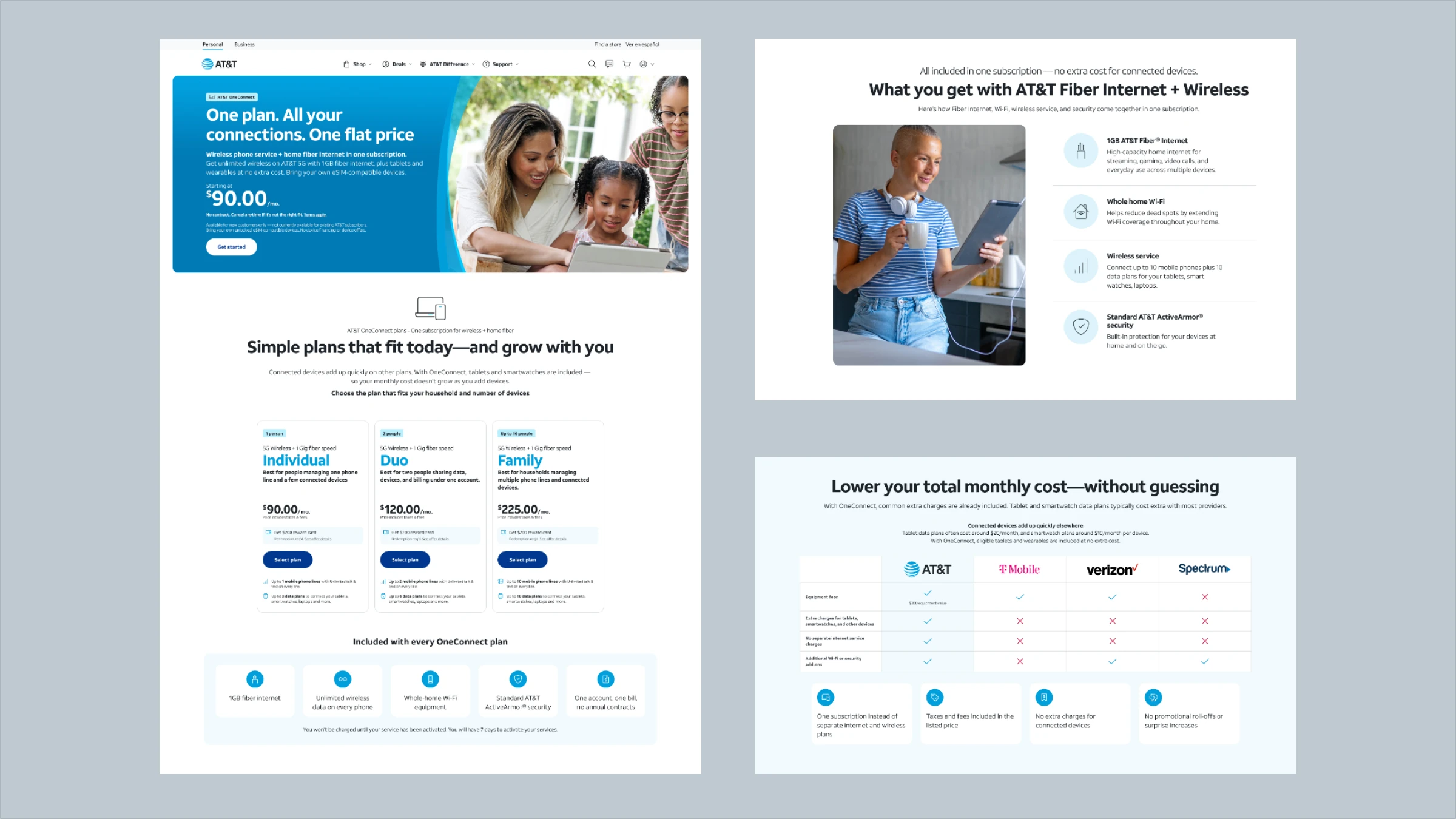
OneConnect bundles fiber and wireless into a single subscription — one plan, one payment. It is not how telecom sells, and it is not how customers are used to buying.
The subscription construct arrived with the project. What did not arrive was any way to buy one. Every network provider sells the same way — pick a device, pick a plan attached to it, port the number, all inside one transaction — and a subscription does not work like that. You buy the service, then bring devices to it. That difference is small to describe and enormous to build a purchase flow around.
The direction for the first release was firm: new customers, buying both services together, with existing customers of either service to follow later. Within that constraint the job was to make the thing buyable at all — and it launched nationally in 45 days.
Then it converted badly. It took research to see that there were two reasons, and that only one of them was ours to fix.
Where it broke
Two drop-offs, at opposite ends of the funnel, with the same cause underneath them.
The first reason was structural. Most people are not in the market for internet and wireless on the same day. Changing both at once is a lot to ask, and a bundle asks exactly that. No page design changes when someone’s contract ends. That problem belongs to phases two and three, which target customers who already hold one of the two services.
The second reason was ours. Behavioral data showed that the customers who were interested behaved a particular way: scrolling deep, opening things, searching the page for answers it did not contain, and then arriving in the cart with almost nothing between choosing a plan and being asked to pay.
What 153 people said
The MVP shipped on a timeline that left almost no room for research. So the research came after — and nobody asked for it.
Forty-five days from concept to national launch meant the first version was built on the concept, the available data, and judgment. Once it was live, we went back and did the work properly: 153 participants, asked whether they understood enough to decide, what information they were looking for, where they were giving up, and what would change that.
We worked at two altitudes. Module by module first — every section on every page of the journey, evaluated on its own. Then zoomed out to the flow as a whole, to see what the sections added up to. Revised, tested again, and kept going until customer confidence moved significantly rather than marginally.
AI is a large part of how that fit the timeline. Concepts were built as working prototypes in Lovable, so participants reacted to something real rather than a description of it, and test plans, questions and analysis ran through AT&T’s enterprise AI tools. The result was not a shortcut — it was more directions evaluated, and more rounds of testing, than the deadline would otherwise have allowed.
The findings split cleanly, and the split is the finding: almost everything about the offer tested well, and almost everything about understanding it did not.
- The concept itself was appealing
- Pricing was trusted and read as transparent
- The shopping experience was liked
- Price comparisons and savings were valued
- Participants said they would consider buying
- Service coverage was unclear
- Plan details were not understood well enough
- Comparing options was harder than it should be
- Setup expectations were opaque
- What happens after purchase was unclear
- Activation and registration needed guidance
People liked it. They just did not know enough about it to buy it.
That sentence is the whole project. It rules out the expensive answers — the product is not wrong, the price is not wrong, the funnel design is not fundamentally wrong — and points at the one thing left: what the journey tells you, and when.
The buy flow was the first thing we tested, and the finding was blunt: customers were being sent from the upper-funnel page directly into the cart. Nothing in between confirmed what they were about to buy, whether it applied to their address, how installation would work, or which of their devices they could connect. They were being asked to pay for something the journey had not yet described.
The launch experience
This feels expensive, but I’m not totally sure what I’m getting yet.”
- Too many concepts introduced at once
- No clear mental model of what OneConnect is
- Price shown before value and fit
- Critical learning pushed into checkout
Structure fixed, anxiety moved
I think this might be right, but I’d want to double-check before paying.”
- Clearer plan hierarchy, less clutter
- Better orientation on the page
- No moment to validate the choice
- Anxiety now peaked entering checkout
Learn, validate, then commit
Now that I see everything together, the price makes more sense.”
- Learning, validation and commitment separated
- Confidence established before checkout
- Price read in the context of value
Round two was the turning point. Cleaning up the page worked — orientation improved — but confidence did not rise with it. The anxiety simply moved to the moment of payment. Participants wanted to check what they were getting before they committed, and the journey gave them nowhere to do it. Round three added that place: a review step between choosing a plan and the cart.
We took the recommendations to leadership. No one had asked for the research and no one had asked for the recommendations; design initiated both. That is what became the three-week fast follow.
What changed
Almost nothing customers needed was missing from the experience. It was downstream of the decision it was supposed to inform.
So the work was less about adding content than about reordering the journey around the decision: two structural changes, then three principles applied at every stage — teach before asking, say the uncomfortable things plainly, and show people where they are.
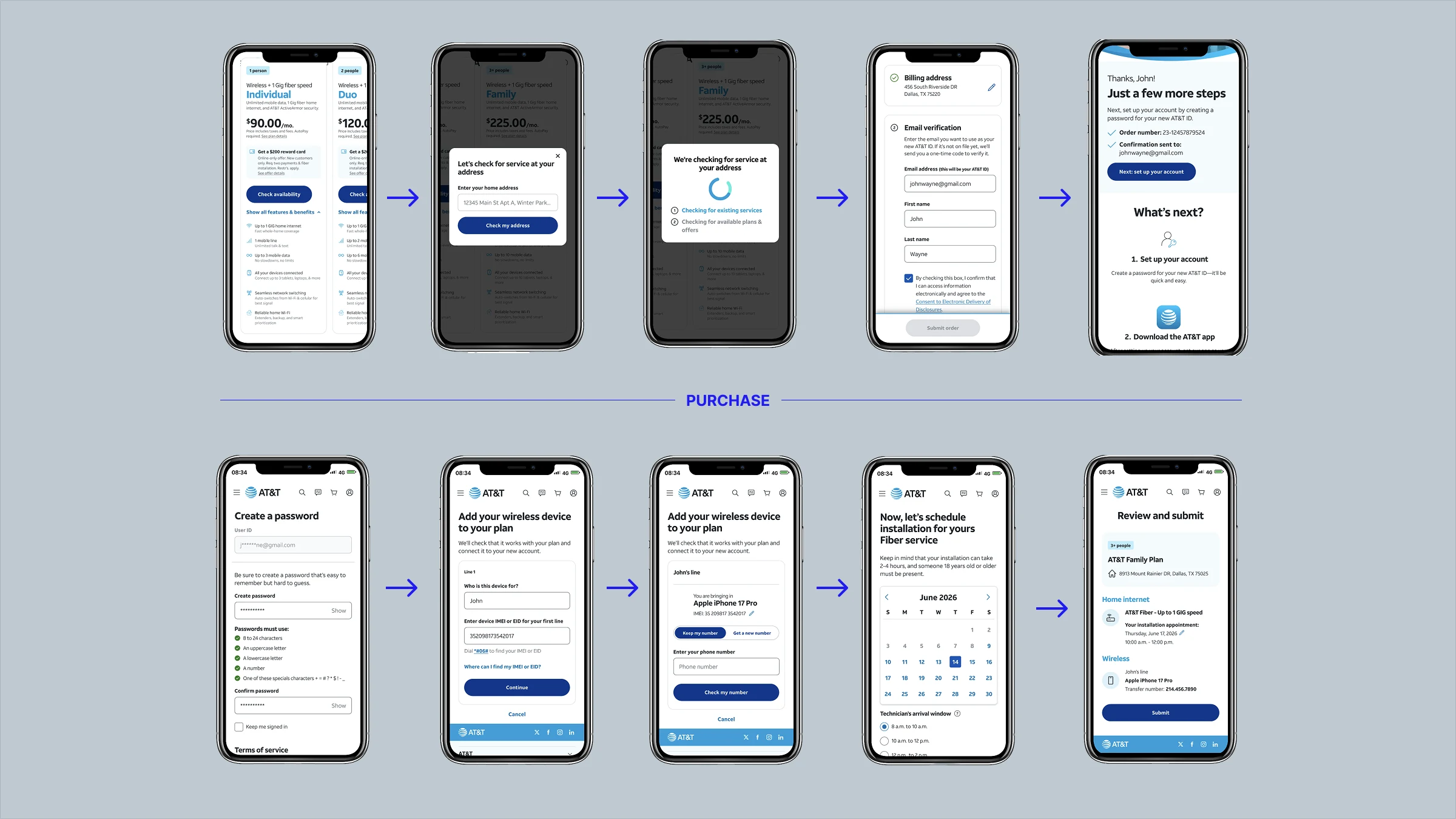
A purchase flow for a model telecom did not have. The subscription was the business’s idea; making it purchasable was the design problem. Rather than force it through a device-first transaction, customers buy the subscription and then add their device details — IMEI and number port — from their account afterwards. It takes the heaviest, most error-prone part of a telecom purchase out of the path to conversion and moves it somewhere the customer can do it calmly, with their phone in hand. It is also the reason account management belonged in this project rather than next to it.
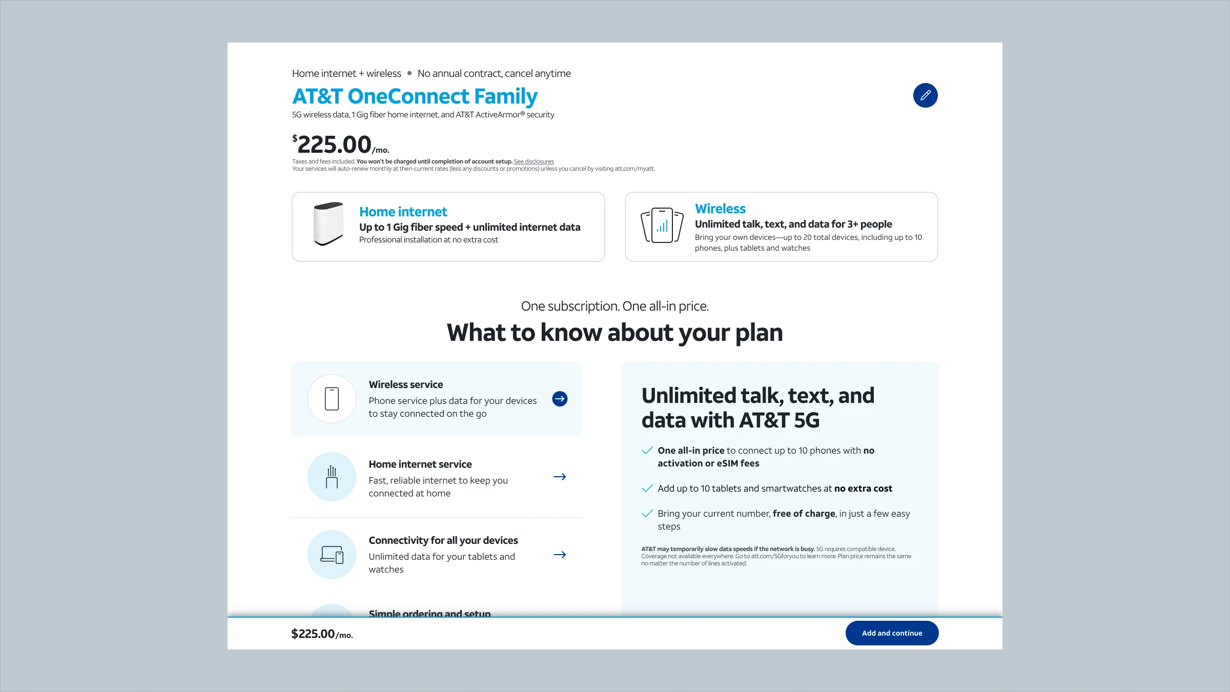
A review step between the plan and the cart. This is the fix the 153-person study produced. Before the cart, a page that shows the customer exactly what they are getting for the plan they chose at the address they entered: the services, whether they qualify for self-installation or need a technician, and which of their devices can be connected as data devices. Only then the cart. It puts the confirmation before the commitment instead of after it, and it is the single change that moved conversion most in testing.
A landing page that supports a decision. The bundle explained as two products, one plan, one payment, high on the page. Connected devices defined where the term first appears — customers could not consistently say what one was, which qualified, or why it mattered, and it was a core part of what they were buying. Broadband facts moved up into the evaluation rather than parked at the bottom. FAQs rebuilt around the questions research recorded rather than the ones internal teams wanted to answer.
Comparison as a first-class feature. Research was explicit that people wanted to compare and found it hard. I proposed comparison against competitors and against other AT&T plans, a simplified comparison for mobile, and clearer savings visualization — so that the cheapest question a customer can ask, is this better than what I have?, gets answered on the page instead of in another tab.
A cart that explains rather than collects. Checkout was a form. I proposed rebuilding it around what a customer is actually buying: service details, what is included, what is required, how the bundle fits together, in language customers use rather than internal terminology. Confidence, not fields.
Progress made visible. A single model for where you are, carried across the whole journey — including the half of it that happens after the customer has paid.
The OneConnect journey, end to end
A thank-you page that says what happens next. OneConnect is bought and then set up. The existing page ended the story at payment, leaving registration and activation to be discovered. I proposed replacing “thank you” with “here is what happens next”: the required steps marked as required, guidance for registration, visible progress, and different paths for desktop and app.
Where it landed
It shipped in phases, and it is still shipping.
None of this was worth much as a set of opinions, so I sequenced it as a testing and delivery program rather than a redesign: upper funnel, lower funnel and post-purchase, each initiative carrying a hypothesis, a rationale, the experience change, a success metric and a priority. That is the artifact seven functions could act on, and it is what the phasing was built from.
Phase one is live. The new-customer experience — landing page, comparison, the subscription purchase flow, the cart, and the post-purchase device and registration path — went from concept to national launch in 45 days. A fast follow — the review step, built on the post-launch research and taken to leadership by design rather than requested of it — landed three weeks after that.
Forty-five days is short for a purchase model that did not previously exist, and it only worked because the roadmap had already sorted what was load-bearing from what could wait. The fast follow is the part I would point at in a review: the MVP was not the answer, it was the first testable version of the answer, and the three weeks after launch were planned for from the start.
In the first half of 2026, OneConnect received the Silver Award in AT&T’s ATS Optimum Team Awards, and I was one of the people named in the recognition — the program caps individual recognition at twenty-five employees across the company. The citation from AT&T’s CTO describes it as the company’s first converged connectivity membership, taken from concept to national launch in 45 days.
And the finding no amount of clarity fixes. The review step lifted conversion among people who were in the market for both. It could do nothing for the larger group who were not. Working with CX confirmed the structural reading: customers are rarely shopping for internet and wireless at the same time, and the bundle asks two purchase decisions to coincide. A clearer journey improves the odds for someone already in that moment. It cannot manufacture the moment.
Phase two launches within the month, extending OneConnect to existing fiber customers, who arrive with an account, a service and a set of expectations a new customer does not have.
Phase three is the hard one. Moving existing wireless customers onto OneConnect carries the most existing state of any of the three, and it is where the edge cases live. I have taken it as far as initial mocks, shared with architects for visibility and with dev leads to get a level of effort against it — because on a change this size the design conversation and the feasibility conversation have to happen at the same time, not in sequence.
Every phase starts from everything the last one learned. Every OneConnect test, design, requirement and roadmap lives in a single AI notebook, so new concepts for phases two and three are generated, tested and analyzed against the full history of the project instead of being rebuilt from memory. It is the closest thing the work has to institutional memory.
Performance against the roadmap’s success metrics is still accumulating. What can be said now is that the work survived a finding that undercut its own premise, and turned into a sequence aimed at the customers most likely to say yes: the easiest population first, the hardest last, and the hardest one already in front of the people who will have to build it.